Splitcoast Dirty Dozen Creative Crew SU Design Team Alumni Splitcoast Challenge Hostess
Registered: November 28, 2004 Location: St. Paul, Minnesota Posts: 11207
Tue, Oct 19, 2021 @ 9:03 AM
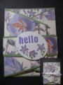
I think they are both very pretty. No wonder you went with that paper! The first one looks more like a friendly card you might pop in the mail. The second one seems like something you would present in person for a special occasion.
Registered: February 19, 2011 Location: Fullerton, CA Posts: 14983
Tue, Oct 19, 2021 @ 7:40 PM
You did have the perfect paper for that fun fold. Those cards look great and as has already been mentioned each gives a different "vibe". Surprisingly (to me anyways), I lean toward the ribbon. I love the elegant look of that beautiful bow against the dp.
Registered: October 12, 2007 Location: Arizona Posts: 70160
Thu, Oct 21, 2021 @ 8:07 AM
Beautiful paper and terrific for the challenge colors. Wonderful design. Either closure looks great. As others said, it might depend on who would receive it and how it is delivered. I like the center piece with the flowers. The ribbon is lovely. Tough choice. Good for you to try a new design. Great card!