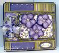
This is my feeble attempt at a monochromatic-style card. I had a great idea, could picture exactly how I wanted it to look, but the final result didn't end up thrilling me very much. I thought about tossing the whole thing several times, but my stubborn side wouldn't let me quit. By the time I finished, I had so much time invested in this that I just couldn't throw it away, so the final result is what it is. The large flowers are double-layered and popped up on dimensionals to add depth to the main image panel.
I started this because I was inspired by a gorgeous creation that I'd seen in Laurie Schmidlin's (Lauraly) gallery. Here's the link to her gorgeous card:* Almost Monochromatic * by Lauraly at Splitcoaststampers
Laurie is amazingly talented---and she's a current Dirty girl, too! She is phenomenally talented, and I always find things that inspire me when I browse her gallery.
Well, enough rambling....for now, anyway. :-)
Thanks for looking, and have a great day!!
Date: Friday, March 14, 2008 GMT Views: 1014
Favorited:19
Registered: May 18, 2005 Location: Connecticut USA Posts: 35783
Fri, Mar 14, 2008 @ 8:24 AM
thank goodness you did not toss it it is beautiful! I think you may have just been hyperfocused on what you THOUGHT it should look like and not the beautiful creation it became. Stunning work Pam!!