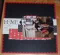
The colors of this page look so much better IRL. I have these pictures enlarged too to put on my wall. Since the Blush Blossom and Almost Amethyst went so well with the pictures, I wanted to use them in the frame for the wall. But the wall itself is a dark burgundy, so in the frame I used a touch of bravo burgundy to tie it all in. I loved that color combo so much I HAD to do a page using it. Like I said- looks much sharper in person- I cant ever seem to get good pictures of my work..
Date: Wednesday, January 30, 2008 GMT Views: 347
Favorited:4