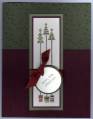
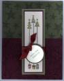
Sample 2 for a possible Christmas card. I like this one with the stars on top just because it will be easier than the tiny little snowflakes from Happy Winter but I think the larger images distracts from the trees and Paisley seems a bit dark...what do you think?
Date: Wednesday, August 29, 2007 GMT Views: 1634
Favorited:15
Registered: March 19, 2005 Location: Stamping away in Minglerville (Freeland,MI) Posts: 5594
Wed, Aug 29, 2007 @ 3:31 PM
Both are very pretty-but I think I agree with you about the size of the images-what if you used versa mark on the stars instead of artichoke? No matter which one you decide to send they will be a hit! TFS~
------------------------------ It's nice to be important, but it's more important to be nice!