This week we visited the fabulous Gallery of our newest Featured Stamper, Barbara Tarayao. Barbara is on the DT for Simon Says and I shop a lot at Simon Says so it was fun to see so many products I have in my stash. Her Gallery is filled with delightfully bold and beautiful cards that are sure to inspire. I landed on this fun card: Flower pop of color thanks by Barbara Tarayao at Splitcoaststampers.
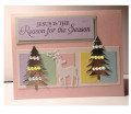
I had every intention of stamping brushed flowers in Barbara's fun colors onto a white panel, but I had that blue strip staring at me on my craft table so I switched gears. I kept Barbara's florals on a center panel and have a die cut on one but switched to an embossing folder; stamped sentiments, different colors, and orientation.
The blue strip of flowers was something I had just been experimenting with a couple days ago. We all know we can swipe our ink pad on the flat side of the ef and get a colored background but I wanted to see if I could somehow get the raised images colored. I used this rather large 81/2 x 5 1/2 ef because I like the big bold blooms and thought it would be easiest for my experiment. I used my CP reinkers as watercolor and using a brush I painted the colors into the crevices of the front of the EF. That took a bit of time so I spritz the ef with water one last time before I loaded the paper and embossed. I really liked the look, but thought there was a bit too much white, so using the same ink and brush I went back on the embossed piece and added a wash of blue just on the flowers. Voila! This EF has a big empty space in the middle for a sentiment/image so I cut the ends off to make the strips. For the card, I decided I needed a bit of an edge so framed it with Bazzill and added the die cut sentiment at the bottom. As much as I like this look, I probably won't do it again. The painting was a bit time consuming and my other EFs (which would fit my A2 cards better) are far too detailed for my limited attention span. But I'm glad I tried it.
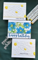
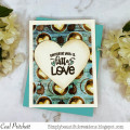
While I was experimenting, I also ran the EF a couple more times and tried just watercoloring the design after embossing as well as coloring with COPICS. I didn't like the watercolor at all -- it was too flat and I wasn't able to get any good shading. I have seen others do it well, but it didn't work for me. The COPICS were better but I noticed my favorite look was the section where I had colored the centers but hadn't started on the other parts yet. I thought that might look super in this layout too so I embossed another sheet, colored the centers and trimmed the ends to get two panels. As one panel was shorter (I was trying to eliminate the blank space from the inside frame), I decided to layer that one with Bazzill; the second panel I cut wider and hid the blank spot beneath the sentiment. I like both looks but the second is more in keeping with Barbara's layout.
Congratulations Barbara on being selected Featured Stamper. I'm sure you have inspired so many crafters on Simon's blog and this week you are inspiring even more in this challenge. I do hope you enjoy the cards made in your honor. And, I hope everyone is having a great day and maybe experimenting a bit with your cards too. You never know what you just might discover. TFL
Date: Sunday, May 7, 2023 GMT Views: 239
Favorited:0
Your trio of cards are all so pretty, Debbie! I love the white flowers with yellow centers! The blue flowers are lovely, too (my fav. color)! I've tried putting color in the spaces of an embossed design and haven't been very nearly as successful as you! Great CASE!
Registered: June 29, 2004 Location: Sugar Land. Texas Posts: 79829
Sun, May 07, 2023 @ 2:42 PM
I especially love the white embossed flowers. The embossing catches the shadows so well on the white and with the 3-D folders it really makes it look so natural. I know what you are saying about coloring on the embossing. I never am pleased with my results either. I do better inking the folder itself rather than me trying to add the color to the embossed image. You nailed those gorgeous centers and it makes a nice contrast.
------------------------------ LizThe joy of the LORD is my strength.Right Brain Madness --My blogProud member of the redDivasKSS certified multi-step stamperFan Club member since 2004
Registered: June 4, 2009 Location: Deatsville, Alabama Posts: 83790
Sun, May 07, 2023 @ 3:20 PM
LOVE the EF you used! Super fun. The white is my favorite. How super you have three cards done and each is delightful! I need to go play with my EFs more. Hugz
------------------------------ Nancy Williams - Hope your day is Spirit-filled and ink-filled (in that order)!DRS Designs-DT, Punchkateerforever, Dirty Dozen Alumni
Registered: February 10, 2006 Location: Mid-Atlantic Posts: 13147
Sun, May 07, 2023 @ 3:38 PM
Debbie, what wonderful inspiration Barbara's colorful floral has given you! Thanks for sharing your fun embossing folder and reinker coloring techniques!
------------------------------ Rita
God demonstrated His love toward us, in that, while we were yet sinners, Christ died for us ... being now justified by His blood, we shall be saved from wrath through Him. Romans 5:8 & 9
Registered: January 24, 2006 Location: Grand Prairie, Texas Posts: 27105
Sun, May 07, 2023 @ 4:14 PM
Well I love each of these for a different reason: the sophistication of the top, the colorful middle and the simplicity at bottom. Sounds like you had fun experimenting and you have such lovely results!
------------------------------ Do or do not - there is no try! (Yoda) / SCS Featured Stamper FS730 / Dirty Dozen Alumni
Registered: March 13, 2011 Location: Langley, B.C. Canada Posts: 32132
Sun, May 07, 2023 @ 5:45 PM
I take my hat off to you in the experimenting. I think they all turned out great. I love your idea to two tone the sunflower centres. (yes we spell it funny in Canada, lol). The yellow framing on the top one really takes your card over the top!
Registered: October 23, 2011 Location: Western, NY Posts: 7513
Sun, May 07, 2023 @ 7:34 PM
Beautiful! Making 3 designs from one embossing folder is clever. From colors added in certain areas and the placement/styles of all the headlines are very cool looking...
Betty
Debbie, these are all beautiful and are a great case of Barbara's floral card. I love all three versions but am especially in awe of the white ones with the touches of color in the centers of the flowers.