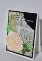
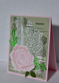
This week's featured stamper is Sandi MacIver who has a fabulous gallery filled with wonderful projects. It was hard to narrow it down to just one, but I went with this one: Fifth Avenue Floral with Ink and water technique by SandiMac at Splitcoaststampers I kept the layout but changed the colors and used a different rose image and leaves.
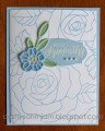
I stenciled here and there on the newsprint (for last week's Ways to Use it challenge) and then sponged the edges before tearing the top right corner. I heat embossed this beautiful rose from Rose Wonder and then painted it with reinkers going for a soft pink look. I did cut a few of the petals off so this rose is smaller than it is on the stamp. I die cut the leaves several times from green cs and vellum. I also punched some leaves using the leaf punch. From there it was simply a matter of assembly. I'm still making thank you cards for my DD to use.
Enjoy your week, Sandi!
Thanks for the challenges and thanks for looking!
Date: Sunday, June 20, 2021 GMT Views: 1172
Favorited:3
Splitcoast Dirty Dozen Splitcoast Challenge Host Proud Fan Club Member
Registered: April 11, 2016 Location: Posts: 30055
Mon, Jun 21, 2021 @ 12:51 AM
Another pretty card. I think this one is my favourite as I love pink. TFS. Happy day
------------------------------ The Difference Between Try and Triumph Is Just A Little Ump Wednesday: Alpha Challenge
Thursday: Ways To Use It Challenge
Monthly: MMJ Challenge….get inky and have fun
Registered: June 4, 2009 Location: Deatsville, Alabama Posts: 82297
Mon, Jun 21, 2021 @ 2:40 AM
Lovely flower, great dp, and super layout - I love this case, Catherine. Very pretty!!!! HUgz
------------------------------ Nancy Williams - Hope your day is Spirit-filled and ink-filled (in that order)!DRS Designs-DT, Punchkateerforever, Dirty Dozen Alumni
Registered: February 19, 2011 Location: Fullerton, CA Posts: 14984
Mon, Jun 21, 2021 @ 11:30 AM
Beautiful card and a beautiful CASE. It always amazes me how different a card in the same layout but different colors, images, dp, etc. can look so different. I love the idea of cutting down the rose image to make it fit your design better. That's a trick I need to remember. All your elements and colors work so well together. Fabulous card.
Registered: June 27, 2012 Location: Washington Posts: 25246
Sat, Jun 26, 2021 @ 3:50 AM
A whole different look in these color shades and almost as beautiful...my fav is the black and two-tone rose. Kraft gives a softer, more vintage look...love your diamond stenciling...wonderful touch!
------------------------------ Carlene aka Chatterbox-1--My BLOG; My Pinterest;My SCS Gallery; FAVORITES Team Member; 2022 Christmas Card Challenge 75/105. My SCS Goal: Challenge Catch-up; Sketch Challenge Sample Card Team (August 2022--January 2023).