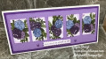
I am happy to be hosting this week's color challenge. I've chosen Cinnamon Cider, Soft Sea Foam and Mossy Meadow as our colors. The dessert option is to add any pink.
I originally saw some fabrics with these colors together and was intrigued. They also struck me as being the colors we see in nature as the Minnesota winter moves towards spring. We've been fortunate to have great weather to be getting outdoors this past week. While we are seeing hints of subtle greens as the snow disappears we still enjoy crispy cinnamon colored scrub oak leaves on hikes around area lakes.
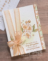
I started my card by stamping the large blossom branch several times: once to be colored and die cut and more as kind of a background toile look. As I played with these pieces I decided to color just the background of the toile piece - in Soft Sea Foam - to use as a border. The main blossom branch includes all the challenge colors though just a bit of Mossy Meadow in the shadows on my leaves. I added a Soft Sea Foam background with my blending brush.
Though I had a few ideas for my pink choice, once I committed to doing a ribbon technique post later this week I couldn't resist using this Petal Pink ribbon for what I now am calling a "suspender bow".
Suspender Bow technique: Fold a large (34-6") piece of twine or ribbon in half. Holding the fold about 1 1/4" from the bottom of of your layers, wrap the rest around the card and bring it up around the bottom. Loop the ends through the fold and tie it into a knot and then a bow. The bow usually holds firm on its own though you can put a mini glue dot under the bow to make it more secure.
I hope you can find a way to work these colors into your art this week! I look forward to seeing what pink you add or if you will go a bit lighter without dessert.
I've posted more about this card and bow on my blog.
Date: Monday, March 8, 2021 GMT Views: 2400
Favorited:8
Splitcoast Dirty Dozen Splitcoast Challenge Hostess Proud Fan Club Member
Registered: September 24, 2007 Location: WA Posts: 13920
Mon, Mar 08, 2021 @ 7:31 PM
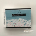
How beautiful! It strikes me how masculine my card is and how feminine yours is, although they both use the same colors (pink aside). By emphasizing the white space, you've created a lovely, feminine card. I especially like the toile design strip you created. (I thought it was DS paper until I read your description.) The ribbon treatment is so pretty, too!
------------------------------ Barbara Splitcoast Dirty Dozen My website: Inky Fun SCS Fan Club Member Color Challenge Team Member QFTD215
Registered: December 3, 2013 Location: Southern California Posts: 3543
Mon, Mar 08, 2021 @ 7:39 PM
Gorgeous card Chris! So well thought out - all the elements come together perfectly! Your toile background is lovely, as is your bow. I admire that; bow making is the challenge of my card making.
------------------------------ Jeanne My blog: spectrum-ink
Registered: June 3, 2006 Location: In my "She Shed Tornado Shelter" Posts: 4010
Mon, Mar 08, 2021 @ 7:57 PM
Well Chris you don't know me well but I love dessert and you can sure tell by my waistline! haha! Anyway, I loved the option of using pink with your hostess challenge! Your card is magnificent, and I'm going to have to try your suspender bow technique! Thank you for sharing not only your inspirational card but the technique too!
Splitcoast Dirty Dozen Creative Crew SU Design Team Alumni
Registered: January 7, 2007 Location: Southern California Posts: 42755
Mon, Mar 08, 2021 @ 10:10 PM
Oh my gosh! This is so elegant and it is certainly interesting to see the same colors expressed so differently. As a lover of green I used green predominantly, while you used more pink. Colors are so fun. This is such a lovely card for a wedding.
------------------------------ Kathy Stamp n Sip with me