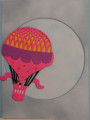
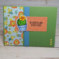
this is for the faux fresco challenge. i saw this tutorial while ago and it was actually the reason that i bought this folder - so of course i had to try and emulate it. the original tutorial panel is much more muted than mine which is how i think it's actually supposed to look. i embossed and coloured the butterflies with the pencils and let dry. i then scraped white paint over the complete panel and let this dry. i then sanded the embossed areas but i did find i had some trouble with this - not all the paint would sand off and some of the paper was starting to so i had to stop. the bright areas are actually a bit of a fluke as the paint didn't seem to cover them completely. i die cut the sentiment and popped it up with foam tape over some silver wire. tfl
Date: Thursday, July 16, 2020 GMT Views: 235
Favorited:3
Splitcoast Dirty Dozen Alumni SCS Gallery Moderator Splitcoast Challenge Hostess Teapot Tuesday TEAm
Registered: July 27, 2007 Location: Dublin, Ireland Posts: 131475
Fri, Jul 17, 2020 @ 1:41 PM
Fixing your keyword (you have TLX) so it shows in the gallery. It's fantastic, love the colours and the sanded look that still shows. I don't know about being more muted. I think that a lot of the older frescoes we see now would have been quite bright and vivid when they were new. I remember the shock of first seeing coloured statues in old Romanesque churches, I'd never thought of then as being anything other than plain carved stone.
Registered: June 4, 2009 Location: Deatsville, Alabama Posts: 82257
Thu, Jul 30, 2020 @ 3:21 AM
Super pretty! Love the folder and all the lovely colors.
------------------------------ Nancy Williams - Hope your day is Spirit-filled and ink-filled (in that order)!DRS Designs-DT, Punchkateerforever, Dirty Dozen Alumni