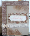
I think it's a bit hard to see what I did. My first attempt was not good, I think this works best with darker cs.
I'm not happy with my photo but it's the best I could do. The teal irl is quite a bit darker and the lime ep looks wonderful on it. I love this color combo and should use it more. I bleached out the insides of the squares. It took a few applications before I was happy. I really liked the lighter green I got from the bleach so I only colored a little bit with some metallic colored pencils. The pencils are quite soft, almost crayon like and you can blend them pretty well. I did leave a little area uncolored in each square. Fun challenges today!
Date: Monday, April 20, 2020 GMT Views: 1221
Favorited:4
Registered: October 19, 2007 Location: Packer Country, WI Posts: 71953
Mon, Apr 20, 2020 @ 5:07 PM
There is so much to love here....the design is different and very eye appealing. Really like the color that the bleach changed the cardstock to. LIke the colored embossing powder. Fav'd
Registered: January 20, 2016 Location: Freetown, Massachusetts Posts: 31437
Tue, Apr 21, 2020 @ 12:09 PM
Wow, Jean! What a great design and an awesome challenge combo! I did think the EP was gold, but that didn't take away from the fabulousness of the card. Love it!
Registered: September 8, 2007 Location: nova scotia - Canada's ocean playground Posts: 8384
Tue, Apr 21, 2020 @ 12:37 PM
luv your image and how you bleached out the squares. I hear you about cameras not showing true colours - that happens to me all the time too! the embossing looks like gold on my comp. but it's very beautiful. it would be amazing to see what the green would look like. cool card!!
------------------------------ If it was so, it might be; and if it were so, it would be; but as it isn't, it ain't. that's logic----Lewis Carroll