I think it's a bit hard to see what I did. My first attempt was not good, I think this works best with darker cs.
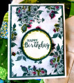
I'm not happy with my photo but it's the best I could do. The teal irl is quite a bit darker and the lime ep looks wonderful on it. I love this color combo and should use it more. I bleached out the insides of the squares. It took a few applications before I was happy. I really liked the lighter green I got from the bleach so I only colored a little bit with some metallic colored pencils. The pencils are quite soft, almost crayon like and you can blend them pretty well. I did leave a little area uncolored in each square. Fun challenges today!
Date: Monday, April 20, 2020 GMT Views: 1228
Favorited:4
Splitcoast Dirty Dozen Alumni SCS Gallery Moderator Splitcoast Challenge Hostess Teapot Tuesday TEAm
Registered: July 27, 2007 Location: Dublin, Ireland Posts: 131672
Tue, Apr 21, 2020 @ 2:23 PM
Absolutely beautiful. I'll imagine lime for the embossing. I've always had problems with bleach directly on cardstock and I've tried many times over the years. I know the freshness of the bleach makes a difference, but I'm also convinced that the brand of cardstock does too.
Registered: December 4, 2010 Location: Minnesota Posts: 16610
Wed, Apr 22, 2020 @ 1:23 PM
This is so striking and really a wonderful feast for the eyes Jean. You have the coolest stamps and toys to play with. I love the soft coloring you did in the squares and the added pearls too. There are some colors that are what I call "camera shy" and I think you ran into that, but I can see the teal and lime, and it is really striking. ~Karen.