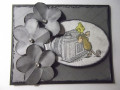
The pink floral card is cut from a gorgeous piece of 6" x 8" DP by cocoavanilla.com.au, designed and printed in Australia. The distressed pink back layer is from the same paper pad.
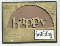
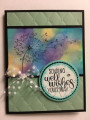
The green card is a mixture of India Inks, spritzed with water, then alcohol inks and squirts and dribbles of isopropyl alcohol, then "kissed" against another large sheet of polypropylene.
This technique is 100% pot luck, just keep dribbling inks, alcohol and isopropyl, dabbing with a soft cloth, kissing the two sheets against each other until you are happy.
Even if you are not entirely happy with some of the areas, it makes great die cut feathers, trees etc.
The sentiment is by Kaisercraft, it comes with a background word shape die and a die with the words.
Thanks so much for looking and I hope you have a chance to join in the teaparty and send some happy paper wishes to the Brookhaven Hospice.
Date: Monday, July 1, 2019 GMT Views: 1084
Favorited:8
Registered: August 15, 2007 Location: Twin Cities MN Posts: 50473
Tue, Jul 02, 2019 @ 4:41 AM
WOW these cards make a real impact with their bold backgrounds...they will really brighten up someone's day. I'm especially drawn to the alcohol one (love green!)...well done Miss Susie.
Splitcoast Dirty Dozen Splitcoast Challenge Host Proud Fan Club Member
Registered: April 11, 2016 Location: Posts: 30055
Tue, Jul 02, 2019 @ 6:36 AM
Love both cards. Tfs my mate over East. Happy week and hope our storm that is coming doesn’t head over your way later this week. TFS. Hugs and happy creating
------------------------------ The Difference Between Try and Triumph Is Just A Little Ump Wednesday: Alpha Challenge
Thursday: Ways To Use It Challenge
Monthly: MMJ Challenge….get inky and have fun
Splitcoast Dirty Dozen Splitcoast Challenge Hostess Teapot Tuesday TEAm
Registered: January 19, 2014 Location: Central Indiana Posts: 90113
Tue, Jul 02, 2019 @ 7:40 AM
Two super terrific birthday cards Miss Susie! I love using DPs for some quick cards when needed. I have a ton of it too and totally need to use more of it up. Thank you so much for joining in and creating two amazing cards for the teapot cause today.
Splitcoast Dirty Dozen Alumni SCS Gallery Moderator Splitcoast Challenge Hostess Teapot Tuesday TEAm
Registered: July 27, 2007 Location: Dublin, Ireland Posts: 131535
Tue, Jul 02, 2019 @ 12:38 PM
Hard to pick a favourite! I really like the pink floral and the prettiness of it, but I'm drawn to the cleaner finish of of the stitched white layer on the lefthand card, and the contrast of the white balloons against that amazing background. I think I figured out that one of the secrets to your backgrounds is a hotter climate and faster drying time .
Registered: January 11, 2017 Location: Wisconsin summer and Arizona winter Posts: 19734
Tue, Jul 02, 2019 @ 1:57 PM
Susie, what great cards you've created! I love the two totally different backgrounds! The floral is gorgeous and then the alcohol ink background is brilliant too! Love them both! The Happy Birthday and balloon die cuts really pop on each card! Some lucky person will be very happy to receive either one of these cards!
------------------------------ Judy aka Gracie "Be a rainbow in someone else's cloud." Maya Angelou
Registered: December 4, 2010 Location: Minnesota Posts: 16610
Tue, Jul 02, 2019 @ 3:17 PM
Stupendous Susie! Simply stupendous! I adore the pink card because that paper is sooo gorgeous and because I love pink so much. However, I also love green and the masculine card is really fantastic too. I love the card designs for both cards and so will the recipients! ~Karen.
Registered: August 10, 2006 Location: Sunny Florida Posts: 25290
Tue, Jul 02, 2019 @ 3:47 PM
Susie, you created two terrific cards. I love the pink card with the beautiful designer paper and the background for the other card. The white balloons look great against the green background. Hugs!


 .
.