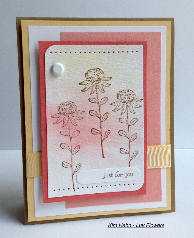
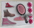
A pretty, soft combination of colors. I enjoyed working with them. The stamping part actually came out simpler than I was originally going for, but I guess that's okay. Life needs a little more simplicity.
P.S. I just went back to see what dessert was, and it is dimension. Yeah!! - I popped up my floral panel as well as the saffron panel. :>)
Date: Tuesday, July 19, 2016 GMT Views: 1113
Favorited:3
Registered: August 21, 2007 Location: Wayland MA Posts: 105271
Tue, Jul 19, 2016 @ 12:01 PM
I really like the simplicity of your card, Kim!! Nice stamps!
------------------------------ Anne HarmonFS154, QFTD58, PROUD FAN CLUB MEMBER (photo of our Great Granddaughter Elise, just 6 months old) and me, even older.
Splitcoast Dirty Dozen Creative Crew SU Design Team Alumni
Registered: May 18, 2004 Location: Southwest Michigan Posts: 37112
Tue, Jul 19, 2016 @ 2:25 PM
Great looking layout showcasing this pretty color combination - the added white really makes those colors shine. I like the piercing and rounded corners, too!
------------------------------ Claudia Splitcoast Fan Club Member