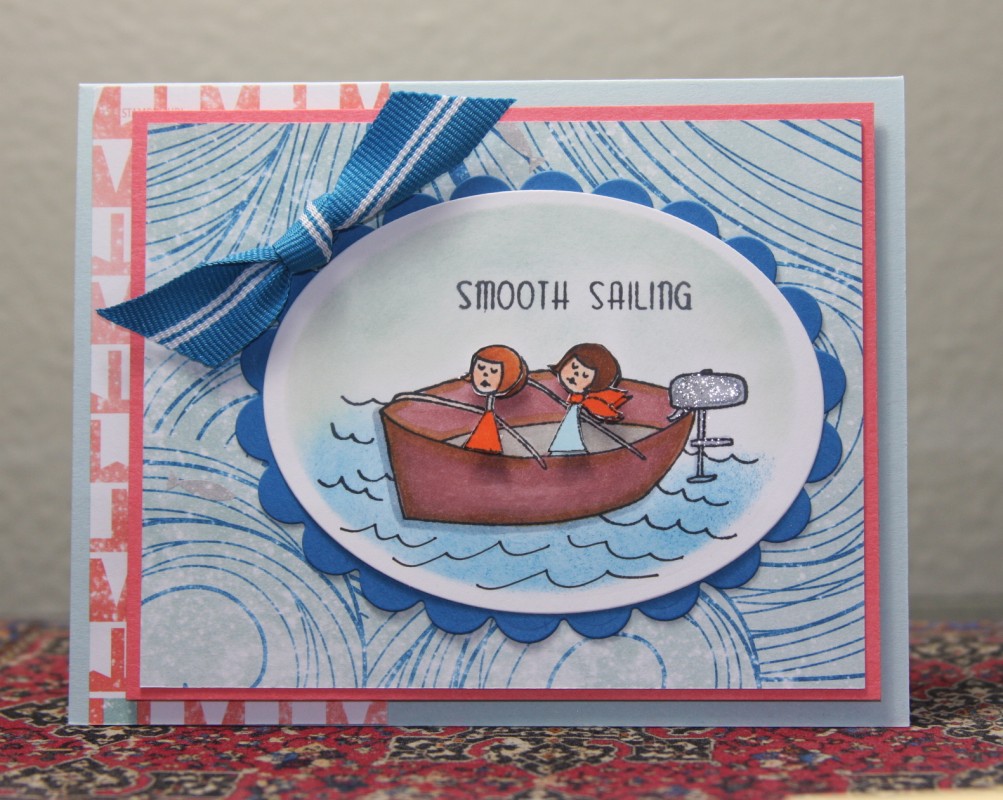
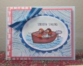
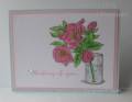
I used the same stamp (changed the sentiment) and layout. But I changed the color scheme, used different papers and cut out and popped up the girls. Overall a more cohesive card. More is More!
Thanks for viewing and commenting. I hope that you are jumping in with both feet this month as we roll out Hope You Can Cling to, our annual card drive for breast cancer patients. Why not use your stamping talent to make a difference and THERE ARE PRIZES at the end. Go for it!
Registered: January 26, 2010 Location: Wisconsin Posts: 79270
Sun, Oct 04, 2015 @ 2:37 PM
Kathy,
I love the rich look of the older card but the new one makes me feel like I am on the water! Lovely shading under the boat and that DP really helps give the feeling of motion!!
Registered: August 15, 2007 Location: Twin Cities MN Posts: 50714
Sun, Oct 04, 2015 @ 3:26 PM
What a cute card..it deserved to be remade but I do have to say I love the color of the old bg (not that the blue isn't nice)..Great job on both cards!
Splitcoast Dirty Dozen Splitcoast Challenge Hostess Teapot Tuesday TEAm
Registered: January 19, 2014 Location: Central Indiana Posts: 91162
Mon, Oct 05, 2015 @ 9:00 AM
Super card that you started with and then you added wonderful changes really brought this card to a stunning recreation. Thank you for supporting HYCCT!