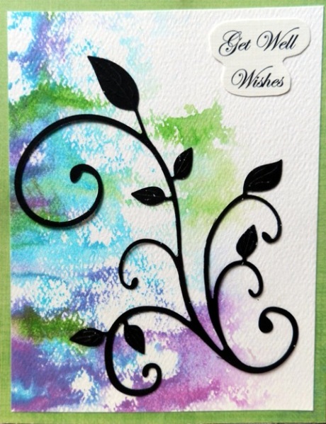
I used the 'ink, spray, smoosh" technique on a shiny ad that came in the mail and pressed it on watercolor CS. The sentiment is temporary and I already pulled it off as I will stamp one when I send the card. I thought it looked too bare, but I'm liking it better without.
I used three different reinkers on the background, sprayed and pressed it onto the cardstock The flourish is an RAK from Precious Kitty. Thanks, Jan. Cheery Lynn, I think?
Date: Saturday, August 31, 2013 GMT Views: 1281
Favorited:5
Splitcoast DirtyDozen Alumni Proud Fan Club Member
Registered: February 22, 2006 Location: Casselberry, Florida Posts: 46530
Sat, Aug 31, 2013 @ 8:51 AM
I'm visualizing this without the sentiment, and I agree with you. I think I like it better without one. The watercolor splotches and flourish look lovely!
Splitcoast Dirty Dozen Alumni SCS Gallery Moderator Splitcoast Challenge Hostess Teapot Tuesday TEAm
Registered: July 27, 2007 Location: Dublin, Ireland Posts: 131503
Sat, Aug 31, 2013 @ 10:45 AM
I think it would work well without - but then I'm not a great one for sentiments unless the card design needs it. The drama of the dark flourish against the texture and colour of the background is great.
Registered: April 6, 2009 Location: Weyers Cave, Virginia in the Shenandoah Valley Posts: 31101
Sat, Aug 31, 2013 @ 11:16 AM
I'm not one for using sentiments much on the front unless I know exactly where the card is going. It's nice to have versatile cards handy! I love this combination of colors and the way they look on your card! Beautiful~
------------------------------ ~Roberta
�Ability is what you're capable of doing. Motivation determines what you do. Attitude determines how well you do it.�
― Lou Holtz


