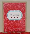
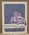
This is for the Clean and Simple challenge this week...faux letterpress! This is a fun and easy technique...basically you ink the de-bossed part of your embossing folder or plate (the part if the image that sticks up) and emboss! This ink falls into the crevices and looks like letterpress!
I tried almost all my embossing plates and folders...the ones that worked best had more negative space, rather than the more solid ones (like houndstooth) and word.numeral ones don't work at all...they come out backwards! Hope this helps you choose!
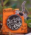
For this card I went elegant...hard to see int he pic but there is fine glitter on the swirly thingie. Also, this CS is an old SU in color, I have no idea what the name was!
Thanks for looking and playing CAS today!
Date: Monday, October 4, 2010 GMT Views: 863
Favorited:7
Registered: August 2, 2009 Location: Northeast Ohio Posts: 1488
Mon, Oct 04, 2010 @ 4:59 AM
Such an awesome technique and this card came out great! I also tried almost all my folders, lol. I really like the white ink over darker colors. It looks subtle and distressed. Great job!
Registered: April 18, 2009 Location: Boston suburbs, MA Posts: 14060
Mon, Oct 04, 2010 @ 5:54 PM
Oh, this turned out beautifully. You achieved a wonderful faux letterpress look--one that I couldn't! I love the great colors you chose for this, too
------------------------------ ~ Emily ~ My BLOG
My kids are on SCS: ponyluvingirl (age 14) and Legoboy (age 10)
I'm a Punchkateer! ~ I design for DeNami Design Rubber Stamps