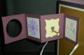
Does this card look like it is missing something?? Good! That is what I was going for.......looking a little stark and lonely.....yay mission accomplished!
Okay, what a Limited Supply Challenge!! Great thinking involved.....and then I failed miserably......
Menu#1: Non-Floral Image
Menu#2: Greens/Browns
Menu#3: (and this is where it get's sticky) a little bit of brads & punches......honestly I forgot the ribbon dang it so I combined two selections from Menu#3......
Date: Friday, June 26, 2009 GMT Views: 449
Favorited:6
Registered: October 7, 2008 Location: Nova Scotia Posts: 1019
Fri, Jun 26, 2009 @ 11:23 AM
I love that fence! I think masculine cards usually DO look like all the 'good' stuff has been left off - at least mine always feel that way, lol I love your torn paper hillside as well!
------------------------------
***Jessi***
Without ice cream, there would be darkness and chaos.~Don Kardong
Registered: April 12, 2006 Location: SLC (Stampin' Like Crazy! hehehe!) Posts: 29991
Fri, Jun 26, 2009 @ 11:29 AM
No worries about the "oops" on #3 . . . I've "oopsed" several times myself. These are, after all, only for inspiration, right? Love the tree, love the fence . . . I think you did a GREAT job!!
Registered: August 21, 2007 Location: Wayland MA Posts: 105275
Fri, Jun 26, 2009 @ 11:54 AM
WOW! I LOVE this, even thought there's no RED! I love that tree, the fence, and all the space. Really works!!!
------------------------------ Anne HarmonFS154, QFTD58, PROUD FAN CLUB MEMBER (photo of our Great Granddaughter Elise, just 6 months old) and me, even older.


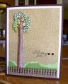


 I love your torn paper hillside as well!