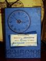
I seem to be on a run with blue of late...I wanted this card to have an earthy and masculine feel to it, I used inking and chalks to help achieve this. The panel on the right was rubbed over the stamp pad and I love the textured look it has given the card. The numbers panel and clock are mounted with 3D foam to help give depth. Layering and textures, two favourites of mine.
Not much more to tell really, I am happy with it - how about you, what do you think? Thanks for taking the time to look!
Date: Saturday, November 1, 2008 GMT Views: 307
Favorited:3
Registered: July 1, 2007 Location: small town near montreal, quebec Posts: 26677
Sat, Nov 01, 2008 @ 4:33 PM
Blue, now what to say about it...I love it, it is my favorite color you know. The masculine feel is achieved and love the clock and big numbers. Love the sentiment too. Fine work Linda.


 Rosy Eckhardt


