Splitcoaststampers.com - the world's #1 papercrafting community
You're currently viewing Splitcoaststampers as a GUEST. We pride ourselves on being great hosts, but guests have limited access to some of our incredible artwork, our lively forums and other super cool features of the site! You can join our incredible papercrafting community at NO COST. So what are you waiting for?
Hi. I am really looking forward to this forum. I am new to stamping/card making and just started a few weeks back. I would love to get some suggestion of how can I improve my cards with affordable techniques without requiring any too fancy stuff. Thanks...
Hi. I am really looking forward to this forum. I am new to stamping/card making and just started a few weeks back. I would love to get some suggestion of how can I improve my cards with affordable techniques without requiring any too fancy stuff. Thanks...
Hello and welcome to SCS! This is a good place to post a card to ask for different ideas. For some reason, no one responded to your post. Sorry about that.
I like your card. Good color combos and image on the inside. How about decorating the front more. Maybe stamping or drawing flowers (for the butterfly), or drawing curling waves to give the impression of wind. A ribbon bow? If you have any food wrappers or packaging materials, cut some flowers out of that and layer them on the card front.
Hi. I am really looking forward to this forum. I am new to stamping/card making and just started a few weeks back. I would love to get some suggestion of how can I improve my cards with affordable techniques without requiring any too fancy stuff. Thanks...
Hi, welcome to SplitcoastStampers! I have learned so much since joining! One tip I picked up is to use lots of white! This contrast makes your colors more vibrant and your features pop.
So for example, your teal pull-out could be white. You could incorporate teal color in your other embellishments, which will highlight the teal in your butterfly (which I love, by the way).
And it's cheap! Look in the CAS gallery for more inspiration.
I hope this is helpful. Keep making cards. We are all improving as we go along. A work in progress!
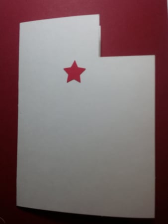
Hey all! I'm moving to salt lake city utah and i have this great idea for a change of address card. This is how far i got so far. Any suggestions on how to proceed? I'm thinking a plane or a map?
Cute idea to use the state outline as the card base. Here's a couple of ideas besides the plane or map
A moving truck with Salt Lake City Bound on the side panel
People next to a signpost with the address, could be stick people if you can't find an image
A house with the new address on it
I would look at the Utah state web site for major attractions. I know there is Temple Square that everyone goes to see, and of course the great Salt Lake (that would look nice on a card). The mountains, skiing, desert hiking... all kinds of outdoor activities to portray or mountain scenes.
Or you could portray your move like the original Mormons who pulled carts for miles and miles with their belongings to Utah.
I have a question! Does anybody know of anyone that makes a custom stamp?? I am trying to find someone WE designed it, I just need someone to make the rubber stamp
I'm new to SCS. When I saw this topic, I knew I had to take a peek! I love getting constructive feedback on my cards, and I love to help, too. I have a few cards I could use some help with. Anybody still on this thread?
Cool! This is my first time ever writing on the message boards. I've only been on SCS for a few weeks, and I've really only talked to one other person: CherylQuilts, who has commented the loveliest comments on my uploaded cards...she is the sweetest! We have talked in a message thing once. Can't seem to find any threads that aren't from years ago. Lol, maybe it's bc I'm a newb and not looking in the correct places. I just didn't wanna post to a dead thread. But if people will come and talk, and help, I'm always looking for constructive feedback on my work. I have several cards (in every stage of the process from done, but seem to be missing something all the way up to just colored stamped images that I have lying around) that have sat on my desk for ages bc I'm stuck. Some of them have finally gotten finished and turned into great cards, but others are still sitting there.
And my husband's no help, lol. He loves (or "loves"--I'm not sure which, bc he seems to listen, even though I'm sure he's bored to tears, bless his heart) all of my cards and says I'm too hard on myself and it "looks great." As wonderful as it is to hear at times, it is frustrating bc I need real feedback, not just compliments. But anyway, I digress... Lol.
Like Cindy, I'm subscribed to the thread. If you want feedback on an unfinished card, the best thing is to attach it to a new post in this thread, since the gallery is for finished creations.. If it's a finished card in your gallery that you think needs a little something extra, you can post a direct link to the card.
PS if you're looking for recent posts, just look over to the left on any forum page. There are a couple of boxes with handy quick links to take you to things like your gallery, the swap forum, the challenge forum...and one is New Posts. (This also covers the non-stamping related sections, so it may seem like a lot of new posts;-).)
And yes, Cheryl is so sweet.
Quote:
Originally Posted by Anasmommy83
Cool! This is my first time ever writing on the message boards. I've only been on SCS for a few weeks, and I've really only talked to one other person: CherylQuilts, who has commented the loveliest comments on my uploaded cards...she is the sweetest! We have talked in a message thing once. Can't seem to find any threads that aren't from years ago. Lol, maybe it's bc I'm a newb and not looking in the correct places. I just didn't wanna post to a dead thread. But if people will come and talk, and help, I'm always looking for constructive feedback on my work. I have several cards (in every stage of the process from done, but seem to be missing something all the way up to just colored stamped images that I have lying around) that have sat on my desk for ages bc I'm stuck. Some of them have finally gotten finished and turned into great cards, but others are still sitting there.
And my husband's no help, lol. He loves (or "loves"--I'm not sure which, bc he seems to listen, even though I'm sure he's bored to tears, bless his heart) all of my cards and says I'm too hard on myself and it "looks great." As wonderful as it is to hear at times, it is frustrating bc I need real feedback, not just compliments. But anyway, I digress... Lol.
Yes, what Sabrina said!
Post your card in this thread & we will give it a squiz (give us a bit of time to contemplate), & offer tips.
I saw your gallery, your cards are great!
Well, I thought it might be a good time to start a constructive criticism thread!!! I know that sometimes I, personally, have cards that I look at and think, "Hmm - something's missing" but I can never quite figure out what that 'something' might happen to be!!! (And I don't think I'm the only one that this happens to ) So here is your chance to post a link to one of your cards that needs 'help' and we'll give it some feedback!!
There aren't really any 'rules', but please please PLEASE keep in mind that this is constructive criticism (keyword: constructive!!) Be positive in your replies, and try to give a suggestion as to how the card could be improved (e.g. 'this card could use some brads in the lower corner')
I guess I'll start with a card that I have never liked I just don't know what's wrong with it!! It is probably the ugliest card in my gallery (correction: it IS the ugliest card in my gallery!!) but I don't know how to improve it!!! Thoughts?? Gingham Wagon
Anyway have fun, and enjoy the constructive criticism fellow SCS'ers have to offer on your magnificent creations!!!
~Rebekah
<3 <3 <3
I think I would use a soft grey copic marker and shadow under the wheels and wagon to "anchor" and then die cut a wavy banner in one of the soft flower colors and emboss the greeting in black on the banner.
Yes, what Sabrina said!
Post your card in this thread & we will give it a squiz (give us a bit of time to contemplate), & offer tips.
I saw your gallery, your cards are great!
Ok! Sorry it's taken so long to respond. The holidays...lol. Kinda glad and sad they're over. Anyway.. I will take some photos of the cards I'm struggling with, and see if you guys can give me any pointers. And, thank you so much for your compliment of my cards! It means a lot. I'm still a newbie. Well, maybe a rookie? Hmm? Anyway...lol.
Boy, I am not sure I am replying to the right card, it is meant to critique the one with the tie.
I think if the scallop edges around the tie graphic were replaced with a straight edge it would follow the masculine look a bit more, rather than "feminine" scallops. I also think the font used for Happy Birthday could be a masculine stamp and could be stamped directly on the panel rather than another attached panel as shown. Cuts down on "so much going on".
I couldn't easily find the card you were responding to, but in general if you check the post date on the actual post with a card which you're looking at, that will give you an idea of whether it's a recent request for input, or an older one when the card is likely to be finished and sent to its destination.
Quote:
Originally Posted by xubie
Boy, I am not sure I am replying to the right card, it is meant to critique the one with the tie.
I think if the scallop edges around the tie graphic were replaced with a straight edge it would follow the masculine look a bit more, rather than "feminine" scallops. I also think the font used for Happy Birthday could be a masculine stamp and could be stamped directly on the panel rather than another attached panel as shown. Cuts down on "so much going on".
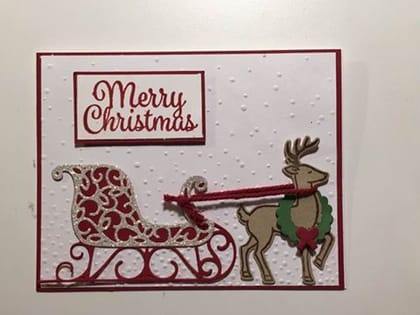
Help! I need some opinions on this card. I like it, but it was super time-consuming to make (stamping, lots of die cuts, embossing, layers, etc.) so I can't decide if it's worth making them for my whole Christmas card list. If I loved it, I'd be ok with putting in the time to do it, but I just don't. Any suggestions to make it easier or should I just go in another direction?
How large is your Christmas list? I really like it. If I were making a bunch of them, these are the two things I'd change to make it quicker and and easier. I'd try stamping the sentiment directly on the base (remembering to do this before embossing!!), and I think gold or silver cord for the reins might be decorative enough that you could skip the wreath around the deer's neck.
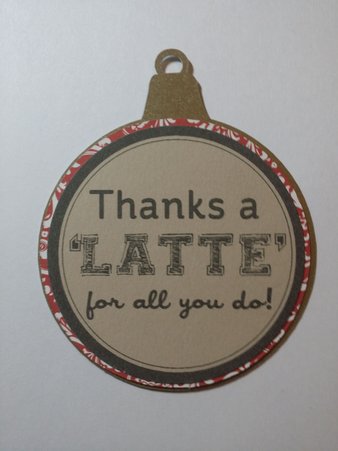
Hey. I am so very new to this. The set Icing on the Cake is one that I could not live without. So struggling.
Shell border. Masking. Order of stamping?
Flowers, depth? Masking?
Cute card - I just bought this set, but haven't used it yet. Maybe you could you stamp a flower and cut it out, then pop it up on top of one that you stamped on the card (I'm thinking the one in the corner maybe) to give it some dimension? Or some Wink of Stella on the flowers to add some bling?
I loved the concept of this Wine & Cheese EF by Darice but after a year & a half of EPIC FAILS, I am about ready to toss it in the garbage! It is TOTALLY ineffective when left all white and not much better whether I try adding color to the embossed area or inking the negative portion - Any help or suggestions would be greatly appreciated!!
PS - I am SO frustrated at this point that I would even consider packaging it up and sending it to somebody who would like to try their hand at this . . . . .
__________________ Linda aka Bubbles
I'm not a Hoarder . . . I'm the Curator of an extensive collection of embellishments!!
Proud Fan Club Member Guest Designer Color Challenge July 2017 Favorites Notification Team
Last edited by bubblestx4; 06-22-2019 at 09:05 AM..
I loved the concept of this Wine & Cheese EF by Darice but after a year & a half of EPIC FAILS, I am about ready to toss it in the garbage! It is TOTALLY ineffective when left all white and not much better whether I try adding color to the embossed area or inking the negative portion - Any help or suggestions would be greatly appreciated!!
PS - I am SO frustrated at this point that I would even consider packaging it up and sending it to somebody who would like to try their hand at this . . . . .
Hi there,
I really love how you coloured the die, it looks great! If you wanted to use the die without coloring it, would black work, with a sunset coloured background, like a silhouette?
I can't help because I struggle with "scene" embossing folders muddy. But I just wanted to say that I liked your card in the WT gallery and I like the other one you posted here. The only thing I suggest you could try is either embossing folder stamping for a loose watercolour look, or inking the embossing folder.
Linda, I really like both cards. I think you're too hard on yourself. Another fun option is Core'dinations cs. This would be fun to emboss and lightly sand to expose the white core. I've got some black core too.
Thanks to all who responded to my plea for help! Altho many of you seemed to feel the original card was fine as it was, I did get a few suggestions to Keep the background but add highlights and shadow with pencils to the embossing - Since I'm not particularly artistic this rather scared me but I persisted with a bit of pencil and a WHOLE lot of gum eraser and actually ended up with a card I am much happier with. I also did one brayering the DE-bossed side of the folder and I'm REALLY liking that version!
Again thanks to all for your input on my original card!!!
Linda Mayberry
__________________ Linda aka Bubbles
I'm not a Hoarder . . . I'm the Curator of an extensive collection of embellishments!!
Proud Fan Club Member Guest Designer Color Challenge July 2017 Favorites Notification Team
Last edited by bubblestx4; 06-22-2019 at 09:05 AM..