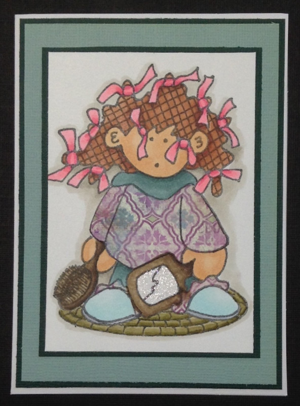
Today's WT650 was to rescue a card from the past by redesigning. My first card was made larger so I could add more detail. Over the years on SCS, I have learned many times less is more. This sweet little girl needs to be the main attraction, not the frills. Here was my first version. I hope she is happier in this version - lol. I know I am.
Registered: March 29, 2011 Location: Covington, WA Posts: 32470
Thu, Aug 24, 2017 @ 8:51 AM
This is really cute, Barbie. I love the colors and letting your cute little girl be the star of the show is very effective! Thanks for playing in my challenge.
------------------------------ Carla ~ Proud Fan Club Member and Dirty Dozen Alumni.
Registered: February 5, 2007 Location: St. Louis, MO Posts: 92631
Thu, Aug 24, 2017 @ 11:40 AM
They are both darling cards and make one smile, Barb. The newer one does has a freshness with less adornments....and beautiful choice of colors. I think many of us have learned that less can be more! : )
Splitcoast Dirty Dozen Creative Crew SU Design Team Alumni Splitcoast Challenge Hostess
Registered: November 28, 2004 Location: St. Paul, Minnesota Posts: 11240
Thu, Aug 24, 2017 @ 12:58 PM
Both cards are sweet. How wouldn't they be with that sweet image and you beautiful coloring? I agree that your new one conveys the "story" of the image a little more directly.
Registered: August 21, 2007 Location: Wayland MA Posts: 105272
Thu, Aug 24, 2017 @ 1:35 PM
Yes......less is more!!
------------------------------ Anne HarmonFS154, QFTD58, PROUD FAN CLUB MEMBER (photo of our Great Granddaughter Elise, just 6 months old) and me, even older.
Registered: June 23, 2006 Location: Chicagoland, IL Posts: 6729
Thu, Aug 24, 2017 @ 3:57 PM
I totally understand your "more is more" approach on your original card. I wish I could say I have grown enough over time in my stamping to resist that impulse. Alas, no. But I love cards that are cleaner and simpler (even if I can't often make them) and this one is a beauty. The little girl is a star and I love the special touch of making her mirror sparkly. Great card!
Registered: March 28, 2011 Location: Novi, Michigan Posts: 11835
Thu, Aug 24, 2017 @ 6:38 PM
Both of your cards are adorable Barb. Your rescue card does show that less is more. Your darling image definitely takes center stage, and I love the pretty framing and colors.
Splitcoast Dirty Dozen Alumni SCS Gallery Moderator Splitcoast Challenge Hostess Teapot Tuesday TEAm
Registered: July 27, 2007 Location: Dublin, Ireland Posts: 132004
Thu, Aug 24, 2017 @ 11:08 PM
Ha, that's funny because so far most of the cards I've seen have been made less CAS, not more so. I think the yellow ribbon in the original "tied" in very well with her hair, but I think I prefer this one. Her pieced sweater and the sparkly mirror are great.
You list her as High Hopes in the original and WhipperSnapper here??
Registered: October 12, 2007 Location: Arizona Posts: 70680
Fri, Aug 25, 2017 @ 8:43 AM
Cute! Nice job with the clean mats and letting the image take center stage. I liked the yellow ribbon pieces on your first card that went so well with the ties in her hair, but it works great to not have the ribbon, too. Love the sparkly mirror! Well played. TFS
Registered: November 7, 2009 Location: Sacramento Posts: 39175
Fri, Aug 25, 2017 @ 7:54 PM
I liked your first card too, the yellow ribbon embellishments went perfectly with the yellow ribbons in her hair. However, I do like this version a bit better. I like your paper piecing and the shiny mirror is fabulous. Nicely done!