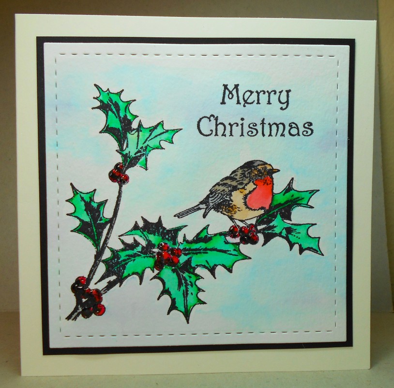
I was super-critical of that earlier version as I just wasn't happy with the layout, proportions, placement of sentiment, etc. So I had to make another one and figure out what worked better for this stamp. I'm really happy with today's version.
I used a different sentiment stamp as it fit better than the one that came with the bird stamp. Also the image worked really well for a square card. And I like the wider border between the black and the outer edges of the card.
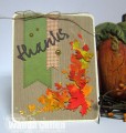
Thanks for looking at something so similar to two days ago!
Date: Tuesday, September 29, 2015 GMT Views: 1323
Favorited:4
Registered: March 31, 2008 Location: Eastlake, OH Posts: 22598
Tue, Sep 29, 2015 @ 10:31 PM
Susan, this is wonderful and truthfully, I love both versions! Love the soft blue you created for the background, something I have not done. Your coloring is beautiful and love the bold colors you chose!
Registered: February 5, 2007 Location: St. Louis, MO Posts: 92578
Wed, Sep 30, 2015 @ 9:30 AM
Susan, I looked at your earlier version...and I agree with you. This card is well-balanced. It is colored beautifully and has a vintage feeling with the stamp that you used.....especially the holly.