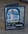
I really love playing in the inspiration challenge! Today's inspiration site was The Wallpaper Collective which had all sorts of fabulous designs to choose from. When I saw this paper in neutrals http://www.wallpapercollective.com/s...ar-rose-1.html I immediately thought of a card by Mrs Noofy WT347 Tres Chic by Mrs Noofy at Splitcoaststampers that I'd put into my favorites in a similar color scheme with a technique that I wanted to try.
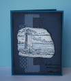
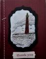
I stamped my lighthouse image in Basic Black on Crumb Cake then used my colored pencils to add the black and white highlights. I distressed or tore all my edges, added a bg in dictionary page featuring the lighthouse definition, added my verse and small hemp accents and called it done. I love this look and hope to try some other images with the same technique.
Date: Saturday, November 5, 2011 GMT Views: 2843
Favorited:18
Registered: September 12, 2007 Location: Wake Forest, NC Posts: 61357
Sat, Nov 05, 2011 @ 6:17 PM
What a wonderful sentiment to match your lighthouse. Your card is interesting and gorgeous as the same time. The colors are wonderful together; and the torn edges add a great masculine touch.
------------------------------
Art Neko and Prickley Pear DTs
Former DT Dolce Designs, Rubbernecker, StampItCrazy,
I Brake For Stamps
DO U KNOW?
BRAK members love to send SCSers cards on their birthdays? Come join us.
"Do not go where the path may lead; go instead where there
is no path and leave a trail." ... Ralph Waldo Emerson
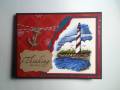
Cape Hatteras is one of my favvvorite places in the world. I spent vacations there most summers all of my life. Thanks for a great memory. Your card is lovely.