Color Wheel 101
by Dina Kowal
Learn to use a color wheel for eye-catching combinations. Each color harmony has a corresponding pdf download showing all possible combinations on the wheel. There are also keywords that you can use to group each color harmony in the gallery.
Supplies
- Links to color wheels mentioned in video:
- Artist Color Wheel - multiple sizes
- Dritz 3169 Rainbow Color Wheel Selector
- Watercolor Color Wheel
Step-by-Step
-
Step 1
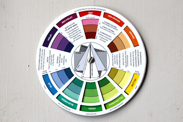
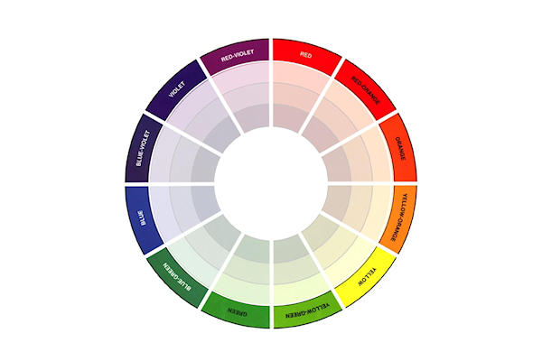
The color wheel is a common artist’s tool that is useful in showing and finding colorful relationships that work. The colors are organized in order around the wheel in 12 wedge-shaped sections, one for each hue or color in the spectrum.
-
Red, yellow and blue are known as the primary colors. These colors cannot be created or mixed from other color elements. They can be mixed together in differing amounts to create all the other colors in the spectrum. They are spaced evenly on the wheel.
-
Step 2
Next in the hierarchy of color are the secondary colors. These are evenly spaced between the primary colors and are created by mixing two primary colors together in equal parts. Red and yellow make orange. Yellow and blue make green. Blue and red make violet.
-
The remaining colors are called tertiary colors. They are created by mixing a primary and secondary color together, and are placed between these two colors on the wheel (their names indicate the color mix).
-
Step 3
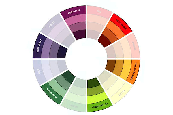
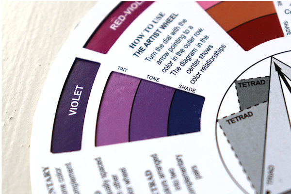
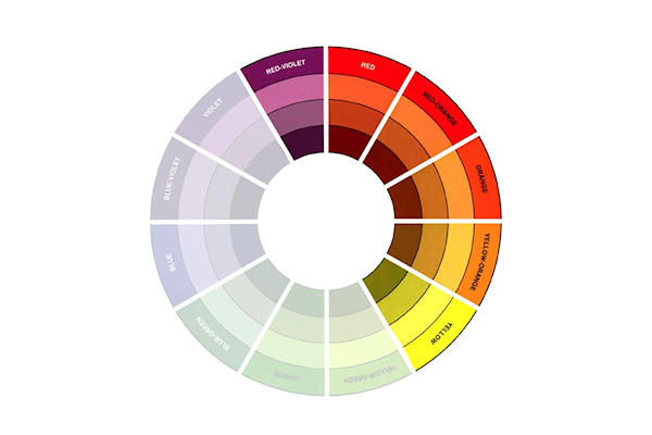
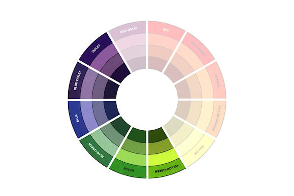
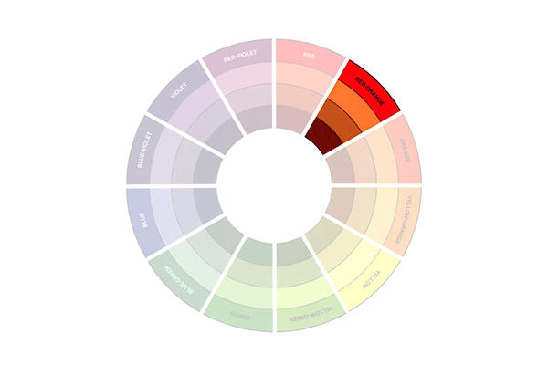
On many color wheels, each section shows a range of values of the hue. The outside ring shows the pure color. The next lighter ring shows a tint of that color (white is added). The next ring shows a tone of that color (grey is added) and the inner ring shows a shade of that color (black is added). Of course, there are many more tints, tones and shades than these depending on the amount of black, grey or white added.
-
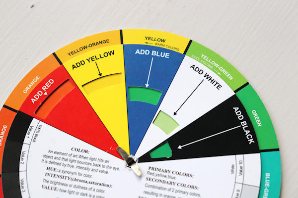
Some color wheels also have a guide for mixing colors. That may be a tutorial for another day. The guide can be turned to any color to show the result of mixing the aligned colors together.
-
Step 4
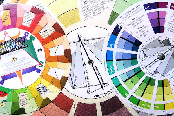
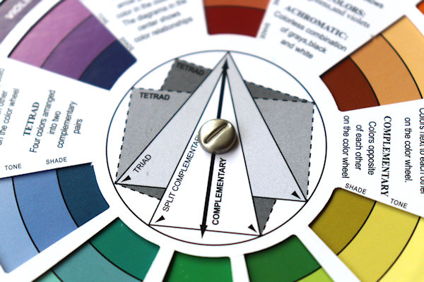
Most handheld color wheels have guides in the center to help choose colors that go together well, based on patterns or symmetry. These are lines or geometric shapes (triangles, rectangle, square). Usually one corner of the shape is chosen to be the key color in the combination – this color will be dominant, while the other colors are used as accents. The openings in the spinning guide help to isolate similar colors.
Other eye-pleasing color combinations may come together successfully depending on personal taste, but here are some traditional guidelines for using the color wheel to choose combinations that are considered ‘harmonious’.
In each entry below, you'll find a pdf download with all possible combinations for that type of color harmony. You can click on the Gallery Keyword for project examples. When you use this guide on a project and upload to the gallery, add the appropriate keyword to the description so your project will show as a sample. -
Step 5
The color wheel can easily be split into warm and cool colors. These colors can be used together based on their similarity. Warm colors are bright and vivid, and evoke excitement.
Gallery Keyword: CW101WARM -
Cool colors are calming and restful.
Gallery Keyword: CW101COOL -
Step 6
A monochromatic color scheme uses colors from a single wedge of the color wheel. This is another color scheme based on color similarity.
Gallery Keyword: CW101MONO -
Multicolor schemes use colors with matching values – in other words, each color comes from the same ring in the wheel (pure colors, or colors that are equally tinted, toned, or shaded).
Gallery Keyword: CW101MULTI
PDF: SIMILAR_COLORS
-
Step 7
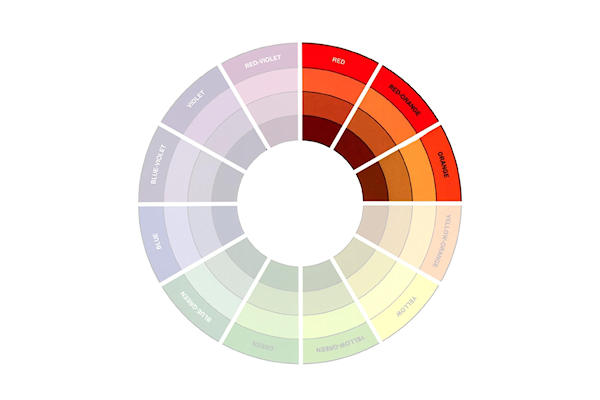
Analogous color harmonies use 3-5 similar colors that are adjacent to each other on the wheel. Usually one of the colors is the key color (often the one in the center) and more dominant. In the color wheel shown above, the spinning guide has 5 open spaces together - this guide helps to isolate analogous color groups.
PDF: ANALOGOUS_COLORS
Gallery Keyword: CW101ANALOGOUS -
Split analogous harmonies include a key color and the two colors one space away on each side. This may also be called a modified triad. In the color wheel shown above, the spinning guide has 3 open spaces together - this guide helps to isolate split analogous color groups.
PDF: SPLIT_ANALOGOUS_COLORS
Gallery Keyword: CW101SPLITANALOGOUS -
Step 8
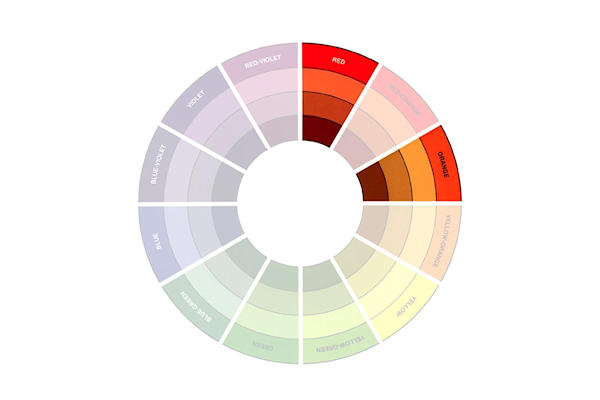
Dyads or dyadic harmonies are composed of two colors, with either one or 2 spaces in between.
PDF: DYADIC_COLORS
Gallery Keyword: CW101DYAD1 -
A dyadic pair with 2 spaces in between is most eye-catching when one color is warm and one is cool.
PDF: DYADIC_COLORS_2
Gallery Keyword: CW101DYAD2 -
Step 9
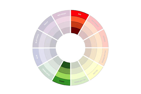
Complementary color schemes or harmonies are made up of two colors directly opposite each other on the color wheel (sometimes called a direct harmony). This color scheme is usually indicated by an arrow across the center of the color wheel. All complementary pairs are made of one warm and one cool color. This combination has the most extreme contrast, so usually one color is chosen as the key color while the other is used as an accent.
NOTE:
Warm colors tend to make objects look larger and are more often used in the foreground of an art piece. Cool colors tend to make objects look smaller or further away, and work well as background colors.
PDF: COMPLEMENTARY_COLORS
Gallery Keyword: CW101COMP -
Step 10
Some variants of the complementary color scheme pull in the colors to the right and/or left on one side to add to the range of color and ease the intensity of the contrast.
A near or side complementary color scheme combines a key color and the color to either the left or right of the complementary color.
PDF: NEAR_COMPLEMENTARY_COLORS
Gallery Keyword: CW101NEARCOMP -
A split complementary harmony uses a key color plus the colors to the left and right of the complementary color. This color scheme is usually indicated by a narrow triangle on the color wheel.
PDF: SPLIT_COMPLEMENTARY_COLORS
Gallery Keyword: CW101SPLITCOMP -
Step 11
An analogous complementary color harmony combines the key color with the complement and its adjacent colors.
PDF: ANALOGOUS_COMPLEMENTARY_COLORS
Gallery Keyword: CW101ANCOMP -
Step 12
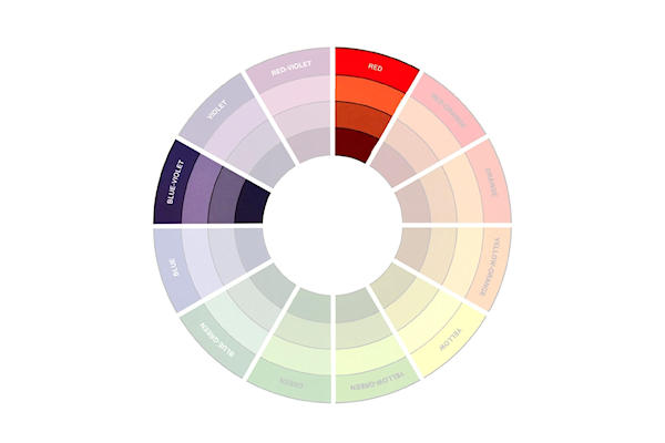
Triadic color harmonies on the color wheel are sets of 3 colors which are equidistant. On a 12 section wheel, there are 3 spaces between the colors. This color scheme is usually indicated by an equilateral triangle on the color wheel. Usually one key color will dominate and the others are used as accents.
PDF: TRIADIC_COLORS
Gallery Keyword: CW101TRIAD -
Step 13
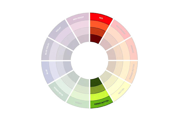
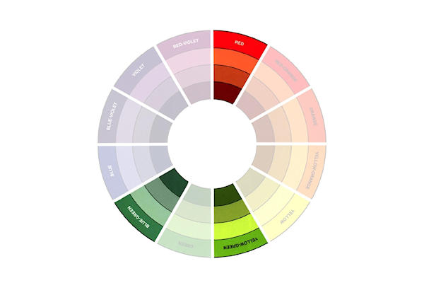
Complementary triads are formed with two complementary colors and the color half way between them on either side of the wheel.
PDF: COMPLEMENTARY_TRIAD_COLORS
Gallery Keyword: CW101COMPTRIAD -
Step 14
Tetradic color schemes use 4 colors, combining 2 sets of complementary colors.
In a dual complementary color harmony there are two sets of complementary colors that are adjacent to each other.
PDF: DUAL_COMPLEMENTARY_COLORS
Gallery Keyword: CW101DUALCOMP -
In a rectangular tetradic scheme there are 2 complementary pairs divided by one space. This color scheme is usually indicated by a rectangle on the color wheel.
PDF: RECTANGULAR_TETRADIC_COLORS
Gallery Keyword: CW101RECTTETRAD -
Step 15
A square tetradic color scheme features 4 colors spaced evenly around the color wheel. This color scheme is sometimes indicated by a square on the color wheel.
PDF: SQUARE_TETRADIC_COLORS
Gallery Keyword: CW101SQTETRAD
-
Step 16
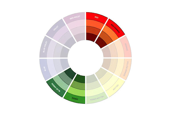
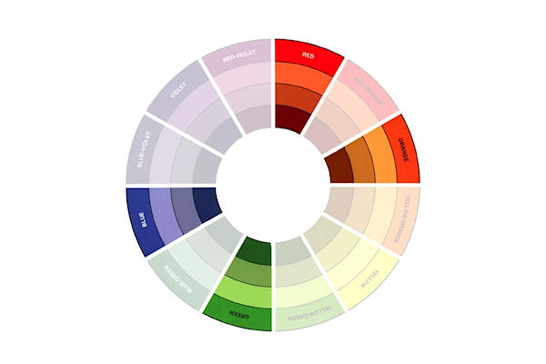
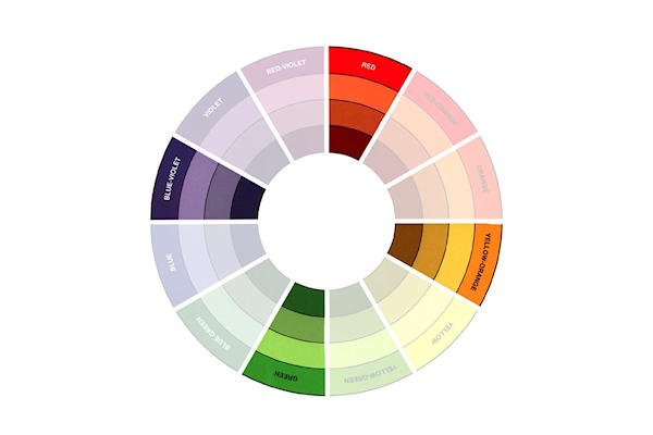
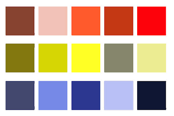
When creating any of these combinations, feel free to lighten or darken any of the colors for more or less contrast or to change the mood. They don’t all have to be pure or dark or light. Here are just a few variations on the red-yellow-blue triadic harmony.
-
Step 17
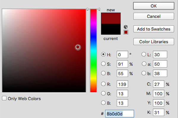
If working on a computer, color pickers and digital color wheels can be useful tools. Photo editing software provides a palette for every hue showing all possible variations.
-
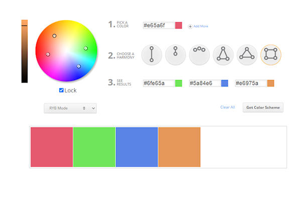
The Color Calculator allows you to input a single color and see it in several different color harmonies. The purest colors are around the edge of the circle. Moving the selection toward the center of the circle controls the tint. The slider on the left controls the shade.
-
Step 18
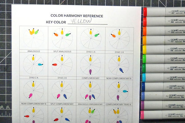
Your turn! Use your color wheel and one of the color harmonies above to create a card or other project! You can use the printable worksheet to explore all the possible color harmonies with any key color. Check out the video below for more instructions.
Copic markers used for the sample chart here: R27, R05, YR16, Y17, Y08, YG07, G05, BG05, B18, BV04, V06, RV06
PDF: COLOR_HARMONY_REFERENCE_SHEET.pdf
Be sure to add the appropriate keyword in the gallery so common color harmonies can be sorted together.
Video!
Your Turn
You've seen the tutorial, now you try it! We've got a section of the gallery set aside for Color Wheel 101. Try this technique, then upload your artwork to the gallery. Show us your creations!
***Please note - Internet Explorer/Edge is not a supported browser, and will not allow you to see the videos. Please use Chrome, Firefox or Safari to view our tutorial videos.






Questions and Comments
We'd love to get your feedback or questions. Leave your comment below.
TFS
Page 1 of 1 pages