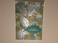
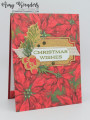
I call this desperate holly because I was really struggling with these colors. I was going a completely different way but after talking to a friend I changed course. And even then it turned out completely different than I thought.
Desperation is the mother of creativity! I felt like I was in school with an assignment and deadline looming. However, I am very pleased with the result.
If you're wondering about the Crumb Cake I used it along with the Mossy Meadow to add some distressing to the edge of the panel.
Thanks Mary for the challenge this week!
Date: Monday, July 4, 2022 GMT Views: 1486
Favorited:5
Registered: September 7, 2007 Location: Miamisburg, OH Posts: 43116
Mon, Jul 04, 2022 @ 7:38 PM
Beautiful results from a non apparent struggle!! I also struggled getting the blue in there but I do like the final result of my struggle as well - I love love love this holly card!!
Registered: October 12, 2007 Location: Arizona Posts: 70055
Mon, Jul 04, 2022 @ 7:42 PM
Love it! Beautifully done. A struggle does not show, only success! Love how you did the leaves and the frosted berries. Very pretty. Wonderful inspiration for the challenge colors!
Registered: February 22, 2012 Location: Cape Cod Posts: 43340
Tue, Jul 05, 2022 @ 7:24 AM
No one would guess that these colors were a struggle for you. A beautiful end result! The combination of mossy meadows and crumb cake are great together.
------------------------------ Priscilla (aka - PJ)
QFTD187 My Gallery
Splitcoast Dirty Dozen Creative Crew SU Design Team Alumni Splitcoast Challenge Hostess
Registered: November 28, 2004 Location: St. Paul, Minnesota Posts: 11166
Tue, Jul 05, 2022 @ 9:20 AM
You've done a beautiful job of pulling these colors together - I think your choice of pink really helps! I had trouble getting the challenge colors to take center stage this week too.
Splitcoast Dirty Dozen Splitcoast Challenge Hostess Proud Fan Club Member
Registered: September 24, 2007 Location: WA Posts: 13885
Tue, Jul 05, 2022 @ 9:39 AM
It's fun to hear about the creative process behind a card, especially when the final result is so gorgeous. I think the pink splatters are what bring it all together, to match the pink berries. This is such a beautiful card!
------------------------------ Barbara Splitcoast Dirty Dozen My website: Inky Fun SCS Fan Club Member Color Challenge Team Member QFTD215
Splitcoast Dirty Dozen Creative Crew SU Design Team Alumni
Registered: May 18, 2004 Location: Southwest Michigan Posts: 36948
Tue, Jul 05, 2022 @ 2:22 PM
This is lovely. The foliage and berries give the look of being partially covered with snow. That woven ribbon is also such a nice touch behind the sentiment label.
------------------------------ Claudia Splitcoast Fan Club Member