I'm delighted to be asked to guest design for the month of February. Thank you, CC team!
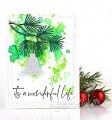
The color challenge is the most difficult challenge for me because I don't think color first. I think media, design, theme, then color. When I saw this week's colors (gorgeous grape, crushed curry, smoky slate), I felt a little stumped. Purple is not a 'go to' color for me; however, smoky slate is my favorite card base cardstock, as you may have noticed. I love gray in general.
What took me in the direction I went was making prints on the gel plate using black acrylic paint and just painting designs free hand. Natasha Foote did a video on it and I was intrigued, especially when she colored her designs. So that's what the leaf branches are. I guess you could paint them right on the cardstock but I kind of like the blotchy, irregular black lines that printing creates. She actually painted her designs on a small zip lock bag and printed. Dessert is a favorite green; green is my favorite color, I have no true favorite hue. I used a combination of the pastel chalk pencils for the color, which is sort of a teal green, and I used a little gray pencil for some shading. I made some gorgeous grape cs, stamped the fanciful flowers (very old clear set) in Versamark, heat embossed and fussy cut. The centers of the flowers are small hole punches of some crushed curry cs I created a few weeks ago (I don't buy colored cs often). I splattered the smoky slate and stamped the sentiment in the same. Smoky slate is my base, of course.
The whole thing is kind of weird, kind of fun, definitely Jean-ish.
Date: Monday, January 31, 2022 GMT Views: 470
Favorited:2