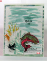
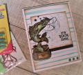
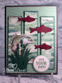
I haven't used this fun Best Catch set yet and the colors are very fishy (LOL). I used every image in the set except the hat and two of the sentiments.
I painted stripes in the colors and then made a panel by splattering the leftover color on the top panel.
The sketch is from the Global Design Project - #GDP186 - here is the link:
Registered: April 16, 2008 Location: Meridian, Idaho Posts: 8507
Fri, Apr 26, 2019 @ 6:26 PM
That trout looks like he's about ready to jump off the front of the card! Great coloring of the fish and creel, with the splatter background adding a nice touch of distress! Awesome guy card Nancy!
------------------------------ Stef
Splitcoast Color Challenge Design Team Splitcoast Dirty Dozen Alumni
Registered: December 30, 2017 Location: arizona Posts: 1412
Mon, Apr 29, 2019 @ 8:26 AM
Really beautiful color combo, that is perfect compliment to each other. The stripes freehanded with paint brush, and the spatters are just wonderful ! Hubby (as others) would just flip if i gave him this. you really hit the mark with fishing fun and ANGLER's of all genders would love to receive this card. the little stickles added makes a great element of reality, when the water glistens off the fish. i am a wife who has sat on the bank of the stream and seen this effect, many many times. hahahhahah Teresa