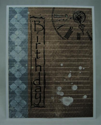
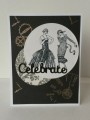
For today's challenge to make a "dude card". I chose some masculine looking dp, added the clock and vertical birthday greeting and embossed. The splatters were probably a mistake!
Date: Friday, April 6, 2018 GMT Views: 1448
Favorited:2
Registered: January 20, 2010 Location: Brampton, Ontario Posts: 26123
Sat, Apr 07, 2018 @ 9:18 AM
I definitely agree with Susy about the spatters. It's what I thought but would not have been able to express as well as she did! :-) I love your slightly enigmatic card! It's dark, subdued, mysterious,... sounds like a description of the love interest from a Harlequin Romance! Great card!
Registered: October 21, 2010 Location: in the okanagan in b.c. canada Posts: 13012
Sun, Apr 08, 2018 @ 11:38 AM
No mistakes in art....I think they add to the classy vintage look....Super guy card. I like your birthday up and down like that too, most I have come across are the other direction...works great...good job...TFs..:0)
------------------------------ We as people are raindrops of colorful ink , falling down Crisp and Clear, each a different shade more vibrant then the last, but once we realize at the bottom of an endless abyss we all fall into the same inkpot forming one color, only then can we come together as one My son.