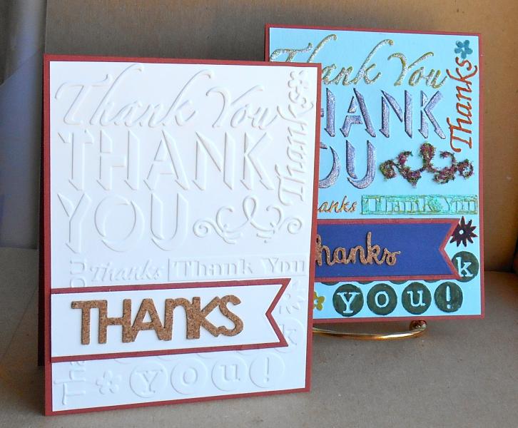
Here's the story. Last Monday, I tried the color-the-texture challenge on the blue panel, hated it and tossed it. Today, I pulled it out of the discard stack and started with the glitter/metallic pen/flowersoft (a mistake, I'm thinking. The flourish looks like a scurvy moustache!) to add texture on top of texture. Still hate it.
I then did the same ef with neenah natural white. I layered a cork die-cut thanks on cs over a scrap of handmade paper with the fishtail flags. So, both cards meet the criteria for wtui.
and of course I much prefer the CAS one.
Okay, so we'll call this effort worthy (?) of the dirty more is more challenge.
tfl
Date: Thursday, July 10, 2014 GMT Views: 3900
Favorited:3
Registered: July 9, 2008 Location: Stars Fell on Alabama Posts: 74743
Fri, Jul 11, 2014 @ 7:53 AM
Super cards and I LOVE that cork. So glad you did the More is More challenge.
------------------------------ My Blog---My Gallery---My PinterestI'm a Punchkateer! (Prez) FOREVERDirty Dozen Alumni2014 CAS Spring DT--- Inspiration Challenge Co- Hostess 12/02/17-12/28/19 Watercolor Wednesday Design Team Hebrews 13:2Brenda
Registered: May 25, 2006 Location: So. Oregon Posts: 121735
Fri, Jul 11, 2014 @ 10:45 AM
okay you got me to laugh. the flower soft does look like its growing a mossy fall thing on the first one. ( and I did not see it until I read the words because, you know Oh Shiny! caught my attention first.)
I love the simplicity of the words in the cork
Registered: March 8, 2005 Location: Halfway between Dallas and Houston Posts: 23975
Mon, Jul 14, 2014 @ 9:44 PM
Mustache description for the flourish is hilarious! Best laugh I have had all day. I do like the glitter pen on the larger "Thank You" on the first card. Maybe if you only did some of them in the glitter and not all of the embossing. But like everyone, I really love the contrast of the cork with the white CS on your second card.
------------------------------ Proud Fan Club Member
Dirty Dozen Alumni
"Art washes away from the soul the dust of everyday life."