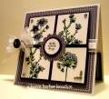
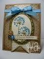
WOW OH WOW OH WOW!!! DID I EVER struggle with these colors!! When I say this card was Take 5, I kid NOT!!! I circular filed several attempts...and finally decided I was really gonna have to choose either the purple or the melon mambo and then downplay the other color because when I put the colors together strong, I just could NOT come up with ANYTHING I liked enough to post!! Vicki - you REALLLY challenged me this time!!! WOWEE ZOWEE......I was exHAUSTED!!! So here is what I finally came up with and I do like it alot, but I'm not sure if I loved the card, or I loved the fact that I finally MADE ONE!!!!! Happy Tuesday everyone!
Date: Monday, March 26, 2012 GMT Views: 7949
Favorited:83
Accessories: markers(melon mambo, eggplant envy, concord crush, pear pizazz, old olive, sahara sand) and blenders, circle and scallop circle punches, white organdy ribbon, antique brads, rhinestones
Techniques: Marker Layering
Difficulty (1-Easy 5-Advanced): 10!!!! These colors were HARD!!
Registered: September 11, 2008 Location: Casa Grande, AZ Posts: 26873
Mon, Mar 26, 2012 @ 8:34 PM
Good grief - I even challenged myself! Not sure WHAT I was thinking! Your end result is of course gorgeous!! Mine on the other hand..... not. so. much. Bummer~
Registered: October 21, 2010 Location: in the okanagan in b.c. canada Posts: 13012
Mon, Mar 26, 2012 @ 9:32 PM
There are so many times a card is so pretty one just cant think of the right word...like this time...pretty is not enough...there is stunning and elegant...all the above...TFs..:0)...neat colors
------------------------------ We as people are raindrops of colorful ink , falling down Crisp and Clear, each a different shade more vibrant then the last, but once we realize at the bottom of an endless abyss we all fall into the same inkpot forming one color, only then can we come together as one My son.
Splitcoast Dirty Dozen Alumni Creative Crew SU Design Team Alumni
Registered: October 29, 2004 Location: Coos Bay, Oregon Posts: 24007
Mon, Mar 26, 2012 @ 9:36 PM
Wow indeed......what a Beauty! I like how you made the purples your main colors along with the watercolor paper neutral. Your 4 sq. images are gorgeous along with your signature ribbon and bow. TFS Karen.......and not giving up!
I love what you did. This is just beautiful. I love the l/o and the details. The pearls and the sentiment in the middle. This is really lovely Karen. Your coloring always blows me away.