This is my sample for Robin's fun Free for All Challenge, the challenge can be found here .
I look upon my card making as a hobby, not necessarily a process that will result in a card. Spending money on a hobby is happy experience and far healthier than thinking every card cost $92.80
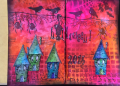
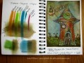
I don't have a typical art journal with gesso'd pages, lots of paint and gorgeous sticky out bits, mine is just an A5 (app 5.5" x 8") Monte Marte (el cheapo) visual art diary. They cost less than $4 so it is never a drama to rip a few dodgy pages out. I stick card fronts onto the pages so the quality of paper is not important. Having said that, the left hand page here was done by colouring directly onto the cheap paper and is not exactly as it would come out on cardstock or photocopy paper, but it is near enough. The whole idea of the book is to remind me about techniques and colours and to use a lot of the weird stamps and sentiments that I have.
I have been doing a lot of bright colouring lately on photocopy paper using Prismacolour Pencils, Distress Crayons / GelatoÂ’s (if you own GelatoÂ’s you already own Timmy's crayons) and alcohol markers. This sample shows how a bright and colourful card can be instantly aged by scrubbing the entire thing with Walnut Stain distress ink.
I often take the super bright look away by gently swishing a pre-stained Walnut Stain foam blending tool over the card, however to achieve this true vintage look I used the Smack & Squirt technique followed by very firm scrubbing of the blending tool over the whole card.
Smack walnut stain distress ink onto aluminium foil, squirt on a fair bit of water and use a foam blending tool to mop up the inky water. Scrub over the card. Give the card a blast with the heat gun before scrubbing on more watery ink, its best to build up the stain rather than inking up the foam blending tool straight from the ink pad.
To continue with the vintage theme, all garden stamping and crackle stamping was down with dark brown (ground espresso) distress ink. Doodled border was also done with fine brown micron pens. The background is from an 8" Graphic45 paper pad from a lifetime ago. I was surprised how much water the G45 paper could take, especially as the grass and sky were also done with the Smack & Squirt technique. The little clock is from a G45 paper and the big clock face is from a Prima set of embellishments. The clock hands were made by using a brad back to front.
Thanks very much for looking. I hope you all have a lovely weekend.
Date: Thursday, September 8, 2016 GMT Views: 2261
Favorited:15
Registered: August 10, 2006 Location: Sunny Florida Posts: 25290
Sat, Sep 10, 2016 @ 4:08 PM
How stunning is this, Susie!!! I love that you journal the art media that you use to create your gorgeous art! You know I adore this digi stamp, and am amazed at the ways you use it! This one is outstanding with the clocks added. The sentiment with the beautiful pumpkins is gorgeous. Thanks for sharing all the details, especially how you use the walnut stain to achieve a vintage look! Hugs, my friend!
Registered: February 3, 2005 Location: Delray Beach, FL Posts: 34769
Sun, Sep 11, 2016 @ 9:20 AM
Oh, sis! This is amazing, and I absolutely love this "card" that you've put into your art journal. Certainly, you could always pull it off and make an actual card from it, but it's wonderful that you keep the "work in progress" page as well. I do something similar as I do a "test run" with colors and then right in the Copic color numbers I used for each element. DH just asked me about that when he saw one for the dahlia card. I then pulled out my notebook with the "mess" of collections. Haha! I should really organize it better. But you are amazing, and one of the most fun things is how you share your experience and tell a story too! You delight us all, sis, and I LOVE you so much! Squishy hugs, sis - always! xoxo
------------------------------ Cheryl
Proverbs 3:5-6 My blog