This is my 2nd card for Geeta's colour challenge. I used Bashful blue, Close to Cocoa & Almost Amethyst. These were the closest colours I had. I also use some matching SU DP the 6x6 limited edition prints.
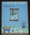
I layered bashful blue overlaping to look like weather boards on a home. Each are 1.5 centremetres thick.
Any way, I thought I had better do another one as I strayed a little to far in my colour palette last timeÂ….it was so hard not to add red and pinksÂ…
I used my stampamajig (SU) for Patch the Pup... I was able to modify and use masking here and there to acheive Patches feet on the window sill... & then had to fudge a little more with my black copic 0.1 marker. Then used the same trusty marker to embellish to make Patches tail look like it's wagging.
Then masking & stampamajig again for the chandelier inside the house. I don't know if you can see the stickles on the little lights.
Then lots of cutting out in front of the telly..grass & flowers also my amuse. SU snail is F-A-B-U-L-O-U-S for sticking all these fine pieces...it's like a handy spider web! breaks off where ya don't need it.
Finally, I'll stop rambling soon, there are amuse micro dot (blue ofcourse) creative candy at the centre of every flower...yum....topped off with "Come PLAY with me" by amuse.
Date: Sunday, June 8, 2008 GMT Views: 994
Favorited:6
Paper: SU Bashful Blue, Close to Cocoa, Almost Amethyst, so saffron, SU DP, white,
Ink: Stazon timber brown, versamark onyx black fine, certainly celery, bashful blue, almost amethyst, close to cocoa, so safron, more mustard, gable green.
Accessories: Stampamajig, fine scissors, copic marker 0.1 fine, amuse creative candy, SU scallop punch, snail, 3D tape (kennel & cart), SU ribbon.