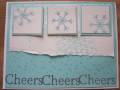
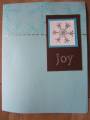
So I really liked the layout of the tall holiday card on page 23, but I wasn't really digging the colours, so here's my slightly modified version in blue tones. I added some designer paper to make the background more interesting, I also got rid of that weird flap, didn't see the point of that part. And the colour pattern doesn't match exactly (for example, in the catalog, the button matches the small background piece).
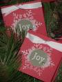
This card also works for this week's LSC- I don't have Happy Everything, so I used the "holiday" from sincere salutation, plus I only used the word "cheer", instead of cheers
Date: Monday, August 7, 2006 GMT Views: 2184
Favorited:22
Registered: May 29, 2004 Location: out and about Posts: 6381
Mon, Aug 07, 2006 @ 10:24 AM
This is fun! I've got my catalog out to look at the original cards in the catty and I love the changes you made to this one. I totally agree about that flap thing - what's the point? And snowflakes look best in blue, IMHO, so your card is just perfect!