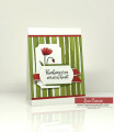
Mary gave us some beautiful colors this week and dessert was perfect for these colors. Although it's difficult to say which green is my favorite, I do find Old Olive to be the most versatile so I used it.
The image is completely die cut and I used the ink of the same color to add shading and depth.
I decided to keep the sentiment celebratory enough to be used for a few occasions - birthday, graduation, promotion, etc.
I hope you decide to join us this week in the challenge!
Date: Monday, March 2, 2020 GMT Views: 3419
Favorited:13
Registered: April 16, 2008 Location: Meridian, Idaho Posts: 8507
Wed, Mar 04, 2020 @ 8:16 PM
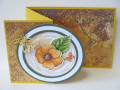
I think Linda nailed the description, the color of the poppies is so rich, they definitely pop against the vanilla background to make one stunning card! Love this Jeanne!
------------------------------ Stef
Splitcoast Color Challenge Design Team Splitcoast Dirty Dozen Alumni
Registered: May 23, 2003 Location: Ontario, Oregon Posts: 9432
Sun, Jul 19, 2020 @ 8:11 AM
Gorgeous CAS design! I especially like the way you incorporated the negative die cut flower into the design of the card. Popping this one into my Favs for an inspiration piece! TFS!