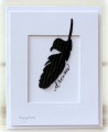
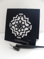
I decided to use different materials for my whites : textured paste, and the calligraphy inks, while my blacks (sorry it looks blue - it's just the lighting in the photo), are just exposed textured black cardstock. I love the contrast I achieved, and had tons of fun playing around with stencils to get the effect of stucco, and the dimension of the raised paste (which is actually soft to the touch)!
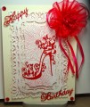
The calligraphy pen shown was perfect for this project, especially since it is a treasured gift from a dear friend, and fellow stamper. (She knows who she is - LOL). I enjoyed using it to hand write my sentiment.
I hope you will join us and explore the artistic contrast of black & white this week.
BIG swishy hugs,
Audrie
Date: Friday, July 8, 2016 GMT Views: 1330
Favorited:4
Registered: October 21, 2010 Location: in the okanagan in b.c. canada Posts: 13012
Sat, Jul 09, 2016 @ 9:43 AM
WOW, so neat a style. If you can write that beautifully you will never have to buy sentiment stamps...well done , and neat pen you did it with. Haven't used mine in so many years. Lovin' the b and w...will be a lovely gallery. Great pattern you used too...awesome....TFS..:0)
------------------------------ We as people are raindrops of colorful ink , falling down Crisp and Clear, each a different shade more vibrant then the last, but once we realize at the bottom of an endless abyss we all fall into the same inkpot forming one color, only then can we come together as one My son.