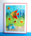
I covered the water color paper with Gesso using a sponge, allowed to dry, then layered rows of Brusho crystals, sprayed with water and let the colors run together. Did a second water color piece using just brown Brusho crystals. Cut the two pieces on a curve, then matched the brown (sand) to the blue/grn/yellow (water). The fish and crab were die cut from failed backgrounds. The white coral is stamped and heat embossed on acetate. The sentiment is from Impression Obsession greetings set. Assembled and added pearls.
Registered: March 31, 2008 Location: Eastlake, OH Posts: 22598
Wed, Jul 22, 2015 @ 5:49 PM
When I see your work with "failed attempts" it makes me want to see your pile of failures! The colors are gorgeous and so is this background! Love the idea of letting the water run down and bleed your colors and love how the sand came out too. Gorgeous card, Priscilla!
Registered: May 9, 2007 Location: Wisconsin Posts: 8704
Wed, Jul 22, 2015 @ 6:37 PM
Oh my Priscilla..............this really looks like what one would see on a coral reef. So colorful and tropical. It is simply gorgeous!!
------------------------------ Mary ~~ QFTD #152, FS#514CC Guest Design Team 2012, 2013, 2017 & 2022 2014 CAS Spring Design Team MemberSC Guest Design Team 2015 & 2022 Dirty Dozen Alumni SU Consultant "Life's greatest adventure is finding your place in the Circle of Life" - Lion King
Registered: May 23, 2009 Location: sunny california Posts: 9825
Wed, Jul 22, 2015 @ 9:39 PM
So creative, Priscilla. The colors are gorgeous...wow can you use brushoes. I live all of your die cut and heat embossed images. The peralscare a fantastic addition. Into my favs.
Registered: October 30, 2007 Location: Posts: 26718
Thu, Jul 23, 2015 @ 7:43 AM
Wow, Priscilla, that background is fabulous and thanks for explaining how you did it! Love the way you created the fish with different "failed" backgrounds - Great, imaginative card! Into my faves...