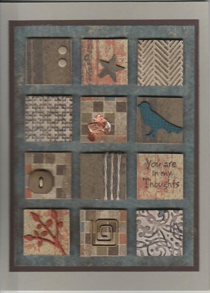
though it might be really hard to see. I liked the neutral palette of this piece and wanted to do something in more neutral shades, but went with a more masculine palette. Since each small square is only 1 inch, the design elements had to be small. I thought of the Well Worn DSP and took my colors from that. Going for a masculine theme was actually pretty challenging, since it gave me fewer elements to work with. I couldn't use lace or florals.
I would have liked a small piece of leather something to use on one of the squares, but made do with some copper flakes instead which looks better IRL than in the scan. Punches and die cuts were layered up three times for some dimension.
I tried to use some similar if more masculine elements, a bird, button, twine, leaves and a star instead of a heart.
Date: Saturday, February 21, 2015 GMT Views: 5215
Favorited:21
Paper: Well Worn DSP, Sahara Sand CS, Early Expresso CS, Dusty Durango CS, Midnight Muse CS
Paper Size: A6
Ink: Soft Suede, Early Expresso, Versamark
Accessories: Inchies, Twine, SU Button, SU Candy Dots, MS Bird Punch, IO Leafy BraNCH dIE, Cuttlebug and SU EF, SU Hardware, Copper Flakes, Su Star Punch, Chocolate Chip EP