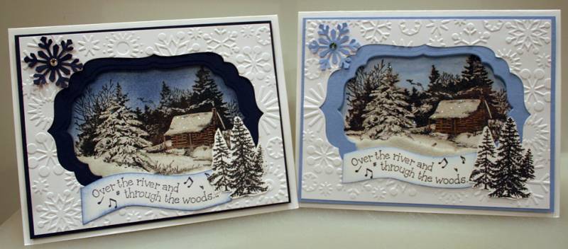
I just love how these cards turned out! I just wish I could find a punch for the trees on the front. Now I have to decide which one I like better, hmmmm... I like them both!
Date: Monday, September 27, 2010 GMT Views: 6168
Favorited:42
Registered: January 22, 2006 Location: knoxville tn Posts: 284
Mon, Sep 27, 2010 @ 5:37 PM
I like them both too! How lucky someone would be to receive one of these cards. I like how the dark blue gives the illusion of more depth and night. The light blue looks like daylight. (IMO) Just beautiful!
Registered: February 24, 2010 Location: Lehigh Valley, PA Posts: 54
Tue, Sep 28, 2010 @ 1:14 PM
Thanks everyone for all the nice comments. I got the cabin stamp at Michaels but it doesn't have a name...it just says inkadinkado. BTW...I too am leaning towards the darker one.
Registered: September 3, 2006 Location: Vancouver Island, BC Posts: 791
Thu, Sep 30, 2010 @ 9:02 PM
Beautiful! I Love these - I couldn't pick between them, they are both perfect. I just bought this stamp and now I'm really glad I did - thanks for the inspiration!
------------------------------ There's always time to stamp - between midnight and 3am!
Registered: September 24, 2008 Location: Victoria, Australia Posts: 6835
Fri, Oct 01, 2010 @ 9:18 PM
Wow - what amazing cards!! So much depth - they look like an oil painting! Love how you added the trees to the front to add more depth. Great job! Wow again!!