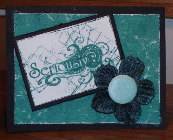
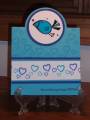
The distressed look is not something that comes naturally to me, so it really was a challenge to do this, but I am really pleased with how it came out. The background is white paper painted with crackle paint and then sanded for extra texture.
Date: Friday, July 25, 2008 GMT Views: 522
Favorited:2
Splitcoast Dirty Dozen Alumni Splitcoast Challenge Hostess Teapot Tuesday TEAm
Registered: February 23, 2007 Location: Brooksville FL Posts: 19759
Fri, Jul 25, 2008 @ 4:37 PM
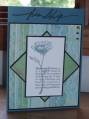
I beg your pardon, missy, would that finger be pointed in any particular direction. This card obviously represents all the turmoil of being a coordinator to the entire group. I feel the pain just looking at it! (BIG smiley here.) This is a great card. I love the way you captured almost a cracked glass kind of look. Great sentiment, Vicki.
------------------------------ Jean2009 Stamping Royalty, Papercraft Magazine; Splitcoaststampers Dirty Dozen, 2016; Proud Fan Club Member; Teapot Tuesday TEAm
Splitcoast Dirty Dozen Alumni VSN Coordinator Splitcoast Challenge Hostess Creative Crew SU Design Team Alumni
Registered: June 12, 2006 Location: On My Mountain!!! Posts: 73310
Fri, Jul 25, 2008 @ 4:38 PM
What a fun technique!! I love the crackle look!! And what a great stamp!!! I think I need to add that to my shopping list!!! LOL Thanks so much for playing in my challenge!!
Registered: December 8, 2005 Location: Iowa Posts: 72949
Mon, Jul 28, 2008 @ 5:03 PM
Crackle paint??? Seriously. Cool.
------------------------------ Paula "The way I see it, every life is a pile of good things and bad things. The good things don’t always soften the bad things, but vice versa the bad things don’t always spoil the good things, or make them unimportant. - The Eleventh Doctor