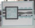
This is a card I made for a co-worker who lost her step-dad. Looking at the card now, it looks a little bright and too cheerful, what do you think? I don't want the card to be a downer, but I don't want it inappropriately happy, kwim? This is why I don't do sympathy cards...I got no clue!!
Thanks for looking
Oh, I used Julee Tilman's Mojo30 sketch for this card...
Date: Thursday, March 27, 2008 GMT Views: 1165
Favorited:17
Registered: October 21, 2004 Location: K'ville NC Posts: 369
Thu, Mar 27, 2008 @ 4:58 AM
This is very pretty! Not sure whether or not it's too bright though. Is there anyone you can ask who lost someone in the past, on how they would have felt? Other than that, this card is very pretty, and I love it!
------------------------------ Lisa Tedder
Kernersville, NC
Visit my BLOG!! www.glitterNfool.com
Registered: March 30, 2007 Location: Vail,AZ Posts: 2046
Fri, Mar 28, 2008 @ 3:39 AM
Amber, it is a beautiful card and IMHO I don't believe in just black or white Sympathy cards. Like it was said before everyone deals differently with a loss, but if it is for a co-worker being all the way over here and not there, it possibly could just be what she needs right now. ;)
TFS
------------------------------ My tiny gallery Sabrina And check this out, I now have a blog.
Registered: April 8, 2006 Location: TX Posts: 28992
Fri, Mar 28, 2008 @ 8:01 PM
I think it is stunning---a gorgeous sympathy....and I agree...sympathy cards do not have to be black and white or monochromatic....just touching and heartfelt! Love it!