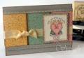
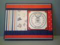
For those of you who participated in this sketch challenge, wasn't it fun choosing 3-4 different but coordinating pieces of designer paper? My choices came from Provo Craft's Bitty Scrap Pads "Heritage Post." Got a little carried away with the layers--there are 11 beginning at the card base and counting up to the blossom!
I wanted the Very Vanilla square behind the flower to have the splattered look of the designer paper, and I don't have a Not Quite Navy marker to use with the air spritzer, so I used a technique taught me by my friend Nancy: I dampened a water color brush, ran it through some Not Quite Navy ink, and flicked the brush handle with my finger (if you try this, be sure to move everything out of splattering distance and NOT to break your brush handle by hitting it too hard like I have). Then I sponged the edges with Not Quite Navy ink.
Thanks for the wonderful sketch, scrapnextras and Roxie!
Date: Tuesday, March 25, 2008 GMT Views: 730
Favorited:4
Registered: August 1, 2006 Location: St. Clair Shores, Michigan Posts: 8802
Tue, Apr 01, 2008 @ 1:06 PM
Shellie, this is beautiful... of course! LOVE all the layers, the dp and colors you chose. I'm also happy you got Embrace Life : )
Love how you were innovative in creating the effect you wanted. On this note, do you have Itty Bitty Backgrounds? It also creates a similar splatter effect. But you did a great job anyways!