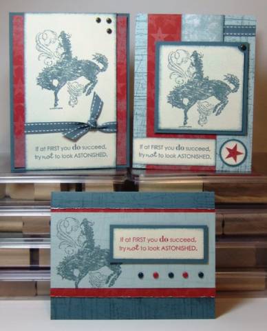
I got a box of new goodies today! It took me a long time to decide what to do for the LSC, but here's my submission. I think what took the longest is deciding on a piece of DP; I could have done this challenge more easily with three plain colors of cardstock I think. Anyway, here it is:
3 stamps: Bronc Buster cowboy, Full of Life sentiment, Sanded background
1 patterned paper: Western Sky (just got it today!)
2 colors of cardstock: Blue Bayou and Soft Sky, plus Very Vanilla as my neutral
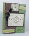
Top left card is SC111. This was the first one I had an idea for, I liked having one big Very Vanilla panel with a ribbon between the main image and the sentiment, and something about the sentiment just really seemed to work with the bronc rider to me. The whole VV panel is sponged with a bit of Soft Sky, and then some Blue Bayou around the edges. I thought about stamping Sanded on it in Soft Sky ink, but I didn't think of it until after I'd gotten the brads and ribbon on there so it was too late. There's only a bit of the Western Sky peeking out around the edges of the card.
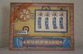
Top right is SC110, which I just did because it happened to be next to SC111. I always thought this sketch was unnecessarily complicated, but at least I got it to work within the confines of the challenge. The bottom right corner was just too empty, even with the Sanded BG (my new favorite background stamp) on the card base, so I cut one of the stars from the DP and mounted it on some circle punches. I used the ticket corner punch in the upper right corner of the bronco panel and put a vintage brad in there; I think maybe I should have used a Ruby Red one but it was already stuck down. Always get the brilliant ideas when it's too late to implement...
The bottom card is SC100...I almost talked myself out of doing a third one, but I like how this one came out where the sentiment takes more center stage. I stamped Sanded on both the Soft Sky panel and the Blue Bayou card base in coordinating inks, and this time I did the sentiment in Ruby Red. The row of brads alternates between Not Quite Navy and Ruby Red, something different than the vintage brads on the other two cards. I roughed up the edges of the patterned paper with my fingernails.
Date: Friday, March 21, 2008 GMT Views: 1816
Favorited:27
Registered: August 23, 2005 Location: LongIsland (said as one word), NY Posts: 21280
Fri, Mar 21, 2008 @ 7:37 AM
Gorgeous cards Christy! LOVE the new DSP you used and the colors are awesome! My favorite is the one right smack dab in the middle...the row of brads is fabu! TFS!!