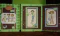
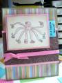
Today our group is doing a challenge for a lady that has visual impairment. We are to case a card of a girl in our group. I am to case Stacy (twinshappy) oh how fun to pick. This is her card I choose Gallery at Splitcoaststampers The thing that attracted me to her card was the vibrant and pretty color. I love it. I also needed to add some texture to our card to help identifiy what the card may look like by touch. I thought this was very creative and super clever of our hostess this week. Very nicely done Judy. And thank you Cindy (mothermark) for bringing this challenge to our group
Last we needed to scope out the entire gallery and choose a style they commonly used. She uses either a lot of square or rectangles and double layers most everything. Lots of ribbon. Her stuff always turns out great no matter what. Stacy I hope you think it turned out ok. I know its not as great, but thanks for the opportunity
sketches 2
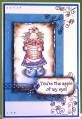
black ink and colored with markers
yo yo yellow, real red and white papers
For texture,I added one large prima one small prima and a red heart jewel in the middle. I also used my cb on the cs and sheer ribbon. I inked the edges of my flower for a little more color. thanks for looking
Date: Wednesday, January 23, 2008 GMT Views: 804
Favorited:7
Registered: November 1, 2005 Location: Posts: 77159
Wed, Jan 23, 2008 @ 9:59 AM
Billie I think its wonderful! Your texture is perfect and I love this little girl image. I love this and I know Ruth will. You were way to kind in your comments about me though!
Registered: June 2, 2006 Location: mother of five, stampin for sanity Posts: 13218
Wed, Jan 23, 2008 @ 10:25 AM
truly lovely!
------------------------------ Debi
sink full of dishes, baskets of laundry, toys everywhere
ink on my fingers, glitter in my hair, life is good!! BLOG