Registered: July 16, 2004 Location: in a virtual revolving door Posts: 79186
Sun, Jan 08, 2006 @ 6:57 PM
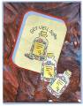
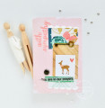
You did an awesome job with the background. I like how you offset the mats behind the Get Well Soon panel, and the two little bottles add the perfect extra touch. Very nifty card!
Registered: February 23, 2005 Location: Red Sox Nation Posts: 12105
Sun, Jan 08, 2006 @ 7:29 PM
Honesty thread: I hope you didn't use your WCC for melted crayon! I really like the layout. I think there's a little too much dark red in the melted background. The color of the "pills" is too pastel for the background. Maybe a little less red and more yellow next time.
------------------------------ Debbi - SU Demonstrator My SU Website
Visit me on Facebook
Registered: May 2, 2004 Location: Far, far away Posts: 24216
Mon, Jan 09, 2006 @ 1:30 AM
Honesty thread: Great design; I love the background and I love the way you did the pill bottles, but I'm not sure they go together on the same card. Personally - and this is only my opinion, mind - I'd use that kind of background for a shabby chic/vintage style card.
Registered: December 22, 2004 Location: Atlanta Baby!!! Posts: 2289
Mon, Jan 09, 2006 @ 4:41 PM
BH Thread - I agree with hemeynell. The background is WOWZER! (I now have to try that technique). But the pill bottles and the saying just don't seem to "fit" with the style. I would do an antique thing or an aged or distressed and use lots of layers...try to pick out colors of cardstock that really match the colors in your background.
Colleen
------------------------------ Colleen Schaan - Education Specialist at Imagination International Inc.,/Copic Marker
Blog - Distinctive Touches;My Copic Books!
Registered: November 6, 2003 Location: Omaha Posts: 3430
Wed, Jan 11, 2006 @ 11:40 AM
honesty thread: I think this is sooo cool! For my personal tastes I would straighten the layers and make it so that first pill bottle is straight up and down and then the two cut out ones trailing off like they are. BUT that is just me! CUTE card!