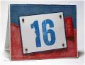
The font of these numbers inspired me to make a card full of all sorts of wear and tear techniques.
I started off stamping the "16", it reminded me of denim, so I set about designing something like a favorite pair of jeans. For the red tab, I ran the paper across my table edge, breaking down the fibers and making the paper bendy.
Next, I stamped the background with linen, and sponged all around the edges. For the ruby red part, I did something I almost never do, I tore, and then I crumpled. Then I rubbed vanilla ink all over and stamped on some paisleys. I attached that to the blue background and reverse pierced all around, then distressed the edges.
The main panel is popped up on pop dots.
Supplies:
Stamps: faux ribbon (PTI), Linen, Polka Dots and Paisley, 2'' weathered crate numbers (gel-a-tins)
Ink: Very Vanilla, Brocade Blue, Palette New Canvas, Beaux Art Blue
Paper: White, Not Quite Navy, Buckaroo Blue, Real Red, Ruby Red
Accessories: copper brads, pop dots, sponge, piercing tool and guide, distressing tool
Date: Friday, December 7, 2007 GMT Views: 659
Favorited:10
Registered: April 16, 2005 Location: Walla Walla, WA Posts: 15082
Sun, Dec 16, 2007 @ 8:55 PM
You're a natural at making cards for this theme (perhaps you actually remember the teen years!). Love the Linen and paisleys. You certainly achieved the look of denim!