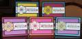
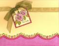
So here's the other five color combos I tried before I landed on the one I chose for my stamp club project. They're all the exact same layout and stamps, but the inner panel is different on each one. The layout is CASEd from this card by PickleTree: Birthday Doodle WT140 by PickleTree at Splitcoaststampers
The top two are both CC44, Taken With Teal, Yoyo Yellow, and Rose Red. I liked that combination (as you can see since I did two of them) but it just wasn't quite what I wanted. Plus that yellow flower on the one on the right is just TOOOOO much. The yellow panel on the left card is left plain; the one on the right is stamped with Tres Chic on the Rose Red panel.
Bottom left is CC43, Rose Red, So Saffron, and Orchid Opulence. I think this card might have worked better if I had done one of the background panels in Saffron, I think it's too dark with the Rose and Orchid together. The Orchid panel is stamped all over with a small flower from Time Well Spent, but you can't hardly see it.
Bottom middle is CC46, Pink Passion and Only Orange. I like hot pink and orange together so long as they're put with black to make them both pop. I *almost* chose this one The Pink Passion panel is pierced all the way around like it was on the original card I CASEd.
Bottom right is CC63--Tempting Turquoise, So Saffron, Orchid Opulence, and Green Galore. I like the Tempting Turquoise and Orchid Opulence together; I just think this particular one would have worked better with just those two colors. And this is when I discovered that my OO ink pad and cardstock do not match--the OO ink looks like Lovely Lilac on the paper. Weird! Middle of this one was stamped with Flannel Plaid. I actually like Orchid Opulence but I don't use it much. Maybe I should use this color combo on some other project and see how I like it.
Hmm, I was staying around the 40's for my color combo ideas for the most part
Date: Monday, December 3, 2007 GMT Views: 2624
Favorited:69
Registered: June 10, 2007 Location: BC Posts: 44872
Mon, Dec 03, 2007 @ 3:54 PM
Now, I would have a really tough time choosing, and I'm going to back and have a second look...it is still tough. Though I have SU papers, it is still a mystery to me as to what colour is what name. I usually say - some SU pink or an SU blue!! Well, I think my fav's are the one on the far right bottem as I look at the screen, and then the red and blue one behind it, and then maybe third, the middle card on the bottem row!! But they would make a really cool set !!
Registered: December 6, 2004 Location: Calgary AB Posts: 1096
Mon, Dec 03, 2007 @ 5:47 PM
Wow...these just a pop a smile right on your face! I love them all. The colours combos are all really great.
------------------------------
*~*~Arleen~*~* "My friends, love is better than anger.
Hope is better than fear. Optimism is better than despair.
So let us be loving, hopeful and optimistic. And we�ll change the world" --
Jack Layton (1950-2011)


 The Pink Passion panel is pierced all the way around like it was on the original card I CASEd.