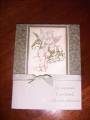
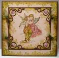
I had to photograph my creation in the sunlight to enable you to see the metallic gold cardstock.... The sentiment shows 2 shadows from the ribbon - this is not on the card.
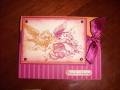
Deep in my inkpad drawer I found Archival Pearlescent ink which IRL is very metallic looking. Hence, I used Bravo Burgandy as my 2nd color to match.
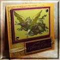
The image was dusted with Perfect Pearls to enhance the metallic effect. Glitter on the wings finalised my image.
Thanks Dawn for a great challenge (and for the stamp set :-))
Date: Thursday, November 29, 2007 GMT Views: 1429
Favorited:2