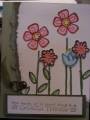
I have had this idea in my head for a while and put it away for a while. Well today was the day for trying it out. I like it but am open to suggestions to making it better. Can my fellow stampers help me improve on it?
Date: Sunday, November 25, 2007 GMT Views: 312
Favorited:3
Registered: September 18, 2007 Location: Ontario, Canada Posts: 1500
Sun, Nov 25, 2007 @ 7:30 PM
Okay I liked the first one but I am loving this one i think it's b/c this one is richer looking with the real red, oink is softer
Either way well done it was an excellent idea
Registered: July 20, 2007 Location: Fergus, Ontario, Canada Posts: 52579
Sun, Nov 25, 2007 @ 10:31 PM
This is gorgeous! I wouldn't do anything to change this. Possibly with the lighter one, because the colors are so soft, you may want to put it on a cardstock that isn't white. Not too dark, but maybe a pale blue or something. Just a thought.
------------------------------ Ina
"Surely His salvation is near those who fear Him, that His glory may dwell in our land." Psalm 85:9