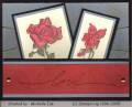
I watercolored the cake and it didn't show up in the scan. The top half of the cake is actually very pale mauve mist. I printed the words on my computer using the font "A Yummy Apology"
Date: Thursday, January 6, 2005 GMT Views: 2115
Favorited:27
Registered: December 4, 2004 Location: Western Massachusetts Posts: 1991
Thu, Jan 06, 2005 @ 10:32 AM
Neat! I love those colors with that stamp - they just seem to match it, somehow!
------------------------------ Jeanne K.
When will Red Riding Hood receive her first Kiwi Kiss? And who ate Chocolate Chip?!??? Find out on the next exciting episode of.... As the Stamp Caddy Turns(my gallery)
Registered: July 1, 2004 Location: shhh, its a dabblin demo secret =) Posts: 3588
Thu, Jan 06, 2005 @ 3:09 PM
super cute! I like how you made the central block kind of long and skinny, great way to interpret the sketch! A yummy apology is my favorite font by the way lol
Registered: July 14, 2004 Location: Living imperfectly with great delight! AB, Canada Posts: 3325
Fri, Jan 07, 2005 @ 10:45 AM
Lovely!
------------------------------ Smiles and laughter, Laurie
Finally I have a Blog..come visit and lend me a hand decorating with some of the nifty sidebar thingys! LOL http://www.actofstamping.blogspot.com/