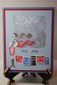
This card needs something but I'm not sure what....I think it needs something in the lower right corner of the Bella panel but I don't really have anything that would go with the card to put there. Plus the colors came out wonky in the scan--Superbella's cape and skirt are pink and the rest of her outfit is orchid, but on my screen it all looks kinda pinky purple. I got the idea to add brocade blue from the color coach, wish I'd thought of that when I colored her in because I would have done the "ground" that color to make it coordinate a little better. I stamped Paisley on the pink panel with orchid ink so it kind of tones it down a little.
Yeah, not quite thrilled with this card but I wanted one to send to my SIL anyway. I'll have to try it again some other time.
Date: Tuesday, April 3, 2007 GMT Views: 422
Favorited:2
Registered: October 20, 2006 Location: rockin' the pink mojo wig in Ottawa, Canada Posts: 2655
Tue, Apr 03, 2007 @ 10:36 AM
Christy, I think she looks great!
Hard to wrap our brain around simple cards these days when there is so much embelishment to play with. Sometimes simple is best.
If it still feels unfinished to you may I suggest putting the word *friend* in the bottom right, or the receivers name or initial.
------------------------------ Some call me Pinky, some call me Lori - I answer to both Pinky's Pictorial DREAM as if you could live forever, LIVE as if you only have today.
Registered: August 10, 2004 Location: South Jersey Posts: 128
Tue, Apr 03, 2007 @ 1:42 PM
I like your card despite your critical eye about it. It's supah!
Hey, to fill the lower right corner, I would draw the "horizon" or "ground" behind her slightly below her boot tops and have it come across the paper, then fade the line top to bottom/dark to light. That should eliminate that bare space that's buggin ya. The shadow would stay near her feet, but you'd kind of see the edge of the surface she was standing on AND take up dead space in the process.