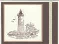
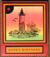
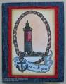
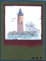
This card took several attempts before I liked the results. I colored the lighthouse scene with Prismacolor pencils and Gamsol, hated the sailboat, sky, and water and cut them off. Sponged a new background and thought it was too plain so I added water ripples and birds with a pen. Hated those and sponged another background. Cut out the inside of the oval frame and thought the square edges around the rope were too WHITE, so I sponged on ColorBox Ochre to cover the white and sponged Close to Cocoa on just the outside edges. That looked okay, but then I couldn't decided what color to use as a frame for the image. At about 11:30 p.m. last night, I took a piece of More Mustard and a piece of Real Red to my husband and held them up to the card and asked, 'Which do you like better?' He told me the red, so that's what I used. :-) At least the card base was easy . . . love those SU! backgrounds!
Date: Friday, March 30, 2007 GMT Views: 1243
Favorited:6