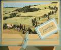
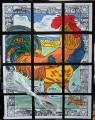
This was a first for me and I gave it a good try but I am not happy with it. As I look at it I think I should have stayed with just green ink and it definitely needed more detail - ran out of time.
Date: Sunday, March 25, 2007 GMT Views: 281
Favorited:2
Additional Info
Stamps: Carte Postale
Paper: Non SU paper, Certainly Celery, Apricot Appeal, Glorious Green Sage Shadow
Ink: Hunter Green, Marigold Morning, Ballet Blue, Close to Cocoa
Registered: January 14, 2005 Location: Vancouver Island Posts: 9572
Fri, Jul 13, 2007 @ 9:48 AM
I love the colours you chose here, and the layout really lets those focal images take centre stage! I hope you think this project is as fabulous as I think it is! TFS!!!!